 DayPilot
Resource scheduling on a horizontal timeline: drag-and-drop editing, scheduling rules, capacity tracking, dependency links, and unassigned work, in one component.
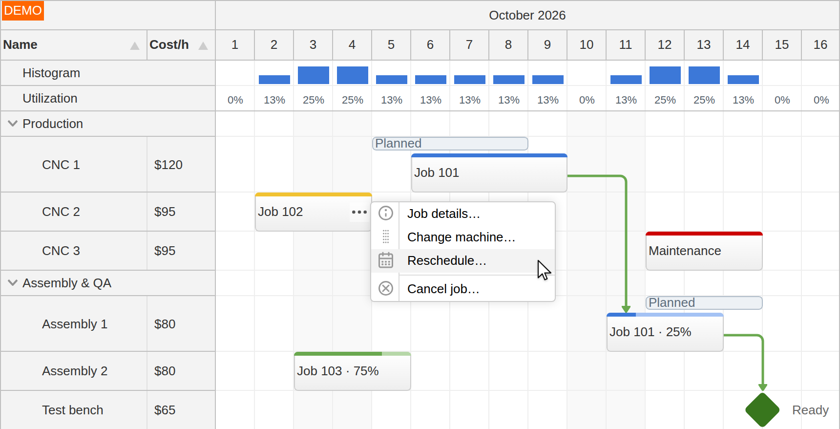
The DayPilot JavaScript Scheduler displays resources down the side and time across the top: people, rooms, machines, vehicles, crews, production lines, or any other schedulable entity. It is built for schedules where the resource axis matters as much as the date: shift planning, dispatching, equipment booking, production scheduling, room allocation, and long-range resource plans.
The same Scheduler can display grouped resources, non-working time, capacity summaries, dependency links, and a frozen row for unassigned events. Your application supplies the resources, events, and any link or capacity data it needs. A separate Queue component can hold unscheduled tasks for users to drag onto the board.
Users create, move, resize, assign, and link work directly on the grid. Your application decides how events are rendered, which changes are allowed, and what gets saved. Your backend stays the source of truth.
Live Demo · Scheduler UI Builder · Download / Try · Explore Tutorials
After loading DayPilot and adding <div id="scheduler"></div> to the page, initialize the Scheduler and load its events:
// init
const scheduler = new DayPilot.Scheduler("scheduler", {
  startDate: "2026-10-01",
  days: 30,
  scale: "Day",
  resources: [
    { name: "Room A", id: "A" },
    { name: "Room B", id: "B" }
  ]
});
scheduler.init();

// load and display data
const events = [
  {
    id: 1,
    text: "Reservation",
    start: "2026-10-08",
    end: "2026-10-12",
    resource: "A"
  }
];
scheduler.update({ events });
For a runnable example with navigation, event editing, and a context menu, start with the open-source JavaScript Scheduler tutorial.
DayPilot Lite is open-source (Apache 2.0) and includes the grid, event creation and editing, CSS themes, and progressive row and event rendering. DayPilot Pro adds features such as resource trees, frozen rows, real-time drag validation, dependency links, and export. See the Feature Matrix for the availability of each feature.
For day and week appointments with time running vertically, see Calendar. For task-oriented project plans, see Gantt; for a month-first overview, see Month.
Resources
People, rooms, machines, crews, or production lines, in a flat list or a collapsible tree, each row with its own fields: code, owner, capacity, status.
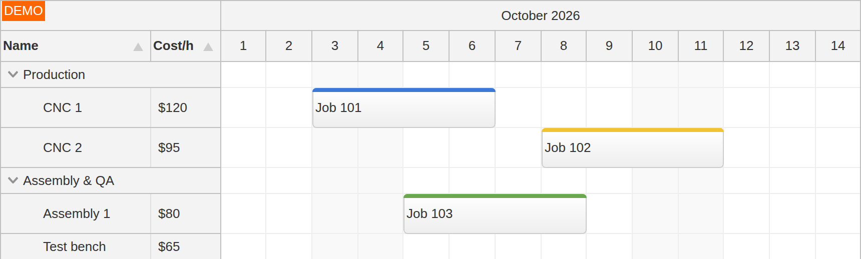
That resource record also feeds row header columns, grouping, summaries, and utilization, so the left side of the board is built from one model.
A resource can be split into several rows, for example to separate its tasks by priority.
Read the resource configuration guide.
Timeline and Views
The time axis runs from minute cells to a multi-year plan, and when the built-in scales are not enough, you define it cell by cell.
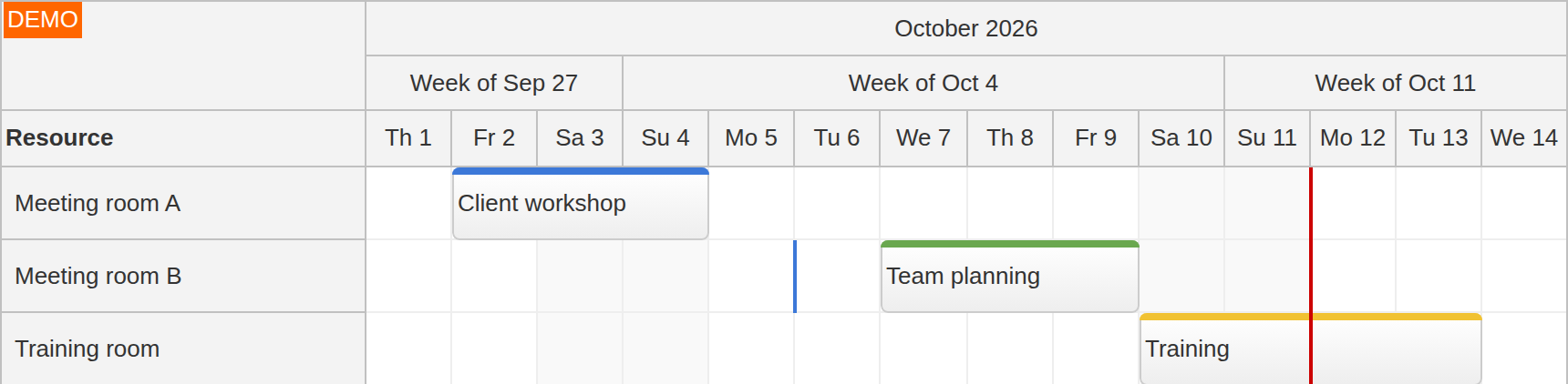
Time headers stack into grouped rows such as month over week over day, with custom content and date formats. Zoom switches between density levels at runtime, and infinite scrolling shifts the displayed date window as the user scrolls toward its edge. Your application loads the events for each requested window.
The same events and resources also render as a timesheet (days on the vertical axis, hours across), a Gantt-style view with one event per row, or a year view with months as rows. You select the layout through configuration. Date separators can mark deadlines across the grid or appear only on the resource rows they concern, such as an inspection due on one machine.
Explore the timeline and view options.
Frameworks and Packaging
Vanilla JavaScript and TypeScript, with native Angular, React, and Vue packages.
The Scheduler runs in plain JavaScript and TypeScript projects and ships with native components for Angular, React, and Vue 3. The wrappers provide configuration and event bindings, access to the full API, and framework content inside events, cells, and headers. You can use JSX in React and slots in Vue. DayPilot Pro also supports Angular templates with bindings and child components. Angular signals are supported.
DayPilot Pro packages are distributed through npm.daypilot.org as direct package URLs for each framework. The open-source DayPilot Lite packages are on public npm under the @daypilot/daypilot-lite-* namespace, and the open-source download also bundles the components into a single production file with TypeScript definitions, useful for script-tag integration or environments where npm isn't an option.
Data Loading and Integration
Events load in bulk, incrementally, or per visible range, and the next window is fetched as the user scrolls into it.
Bulk loading assigns an event array and calls update(). Incremental changes add, update, or remove individual events without reloading the rest. With dynamic loading, the Scheduler passes the requested date range to your endpoint, which returns only that window.
Creating, moving, resizing, or editing an event fires a handler carrying the changed data, so persisting a change is a single call to your API inside that handler. REST and GraphQL endpoints fit directly; no server adapter is required, and the server stays the source of truth.
Drag and Drop Scheduling
Everything drags: events, selections, queue items, rows, even files from the desktop.
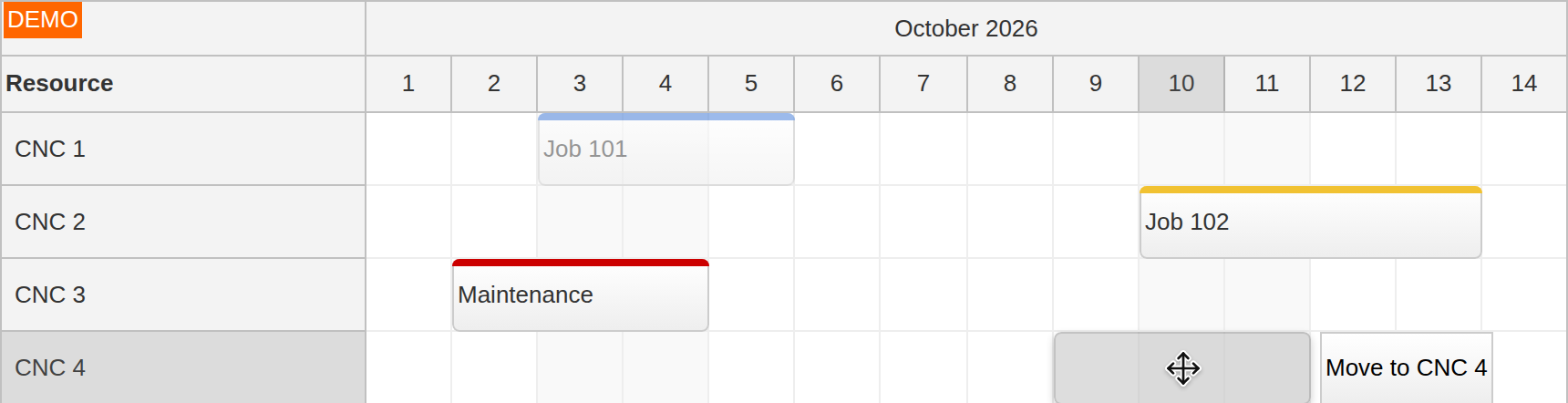
Built-in drag-and-drop interactions in the Scheduler:
Create an event by selecting a time range on a row.
Move events along the timeline or across resource rows.
Resize events by dragging either edge.
You can also:
Add Ctrl+drag copying or copy-and-paste commands using the move and selection handlers.
Drag tasks between the Queue component and the Scheduler in both directions, and unschedule an event back to the queue while keeping its time.
Drag items from any HTML list in the page, or files from the desktop, onto the grid.
Drag events between two Schedulers with synchronized handlers on both sides.
Drag rows in from an external list, reorder them, or move them to a second Scheduler.
The viewport scrolls as a drag reaches its edge. The drag itself is programmable. While the user drags, the application sees the proposed start, end, and row in real time, can adjust the position, and can redraw and annotate the drag shadow. A dispatcher dragging a work order from the queue onto a technician's row sees the schedule react before the mouse is released.
Try the Queue-to-Scheduler demo, or read the drag-and-drop guide.
Bulk Operations
Select events by click or rectangle, across rows and time, and one drag moves or resizes them all.
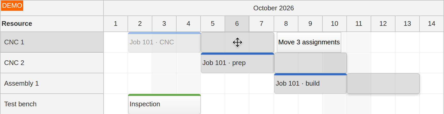
By default, the selected set slides along the timeline and keeps its rows; with resource moving enabled, the same gesture carries it onto other rows. When a production line goes down for a morning, the operator can reschedule everything assigned to it together.
The selected set is also available to your own code, so a batch reassignment or a bulk status change runs on exactly the events the user picked.
Read the selection and bulk-editing guide.
Scheduling Rules and Constraints
Validate each proposed move while the user drags, with your explanation beside the drag shadow.
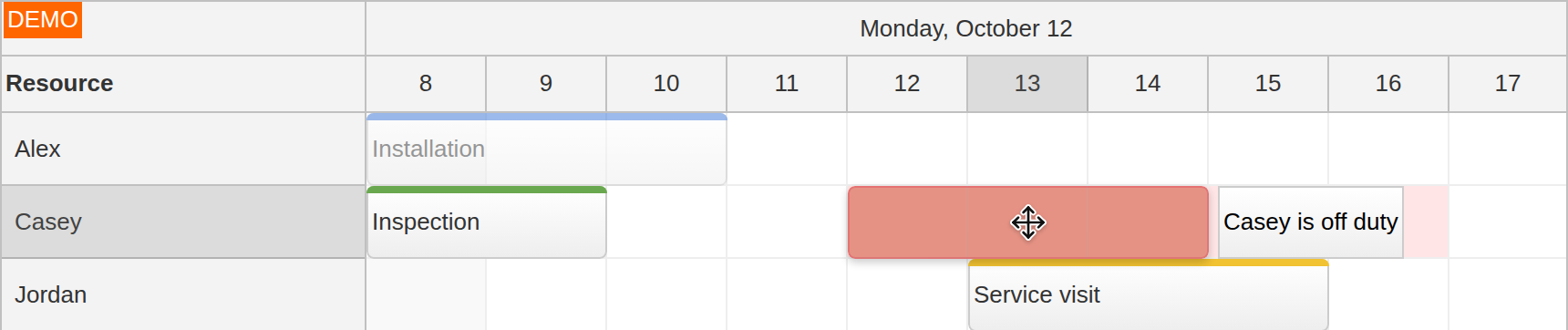
The Scheduler combines built-in constraints with hooks for your own rules.
Built-in constraints cover the standard cases:
Snap to grid: align events to cell boundaries; drag handlers can apply custom snapping rules.
Disabled cells: block specific cells from event creation and drops.
Movement limits: confine events to allowed date ranges, or preserve their duration.
Read-only mode: disable editing globally or per event, based on its data.
Custom rules plug into the same drag-and-drop pipeline:
Real-time validation during dragging: the
onEventMovinghandler fires whenever the target position changes. Your application can approve the target, adjust the proposed start and end, and redraw or annotate the drag shadow. Event resizing exposes the same controls.Before-commit validation: moves, resizes, and creation fire a handler before the change is applied, where you can request confirmation or cancel the operation.
Asynchronous validation on drop: call your server before applying a change, then accept it or cancel it. Checks during the drag itself are synchronous.
These mechanisms compose: the same business-hours data that shades the off-hours can refuse an out-of-hours drop in real time. In real workflows: a plant blocks double-booking of a production line across two work orders; a field-service board keeps jobs inside each technician's shift; a rental desk refuses bookings that would exceed the equipment's daily capacity.
Try the server-validation demo.
Conflicts
Decide at drag time whether a second booking is refused, stacked, shifted, swapped, or marked.
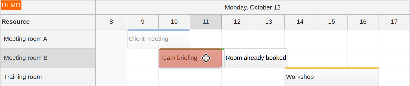
You can forbid overlaps, so an event will not drop onto an occupied slot, or allow concurrent events to stack into lines within a row, with configurable spacing. Event containers can reserve a common time span for related events across several lines, keeping overlapping phases of one job together.
For other policies, your application uses the same drag handlers: detect what already occupies the target and block the drop, shift the new event to the next free slot, push the existing events back, swap the two, or accept the overlap and mark both events for review. A machine can reject a second booking while a ward allows several nurses to work concurrently.
Follow the tutorial on pushing existing events back.
Working Hours
Business hours are set per board or per resource, so one crew's Saturday can be another crew's day off.
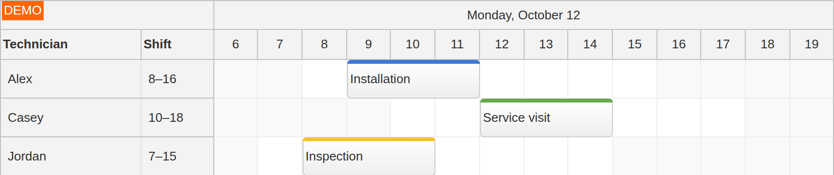
The same working-time data drives both display and rules:
Off-hours render with their own styling, and built-in highlighting covers weekends, today, and the current time.
Holidays load as global or resource-specific application data; your cell and drag hooks use them to style the affected cells and block actions.
Drops into non-working cells can be refused, through the same hooks described under Scheduling Rules and Constraints.
Moving an event can preserve its business duration, measured against the original resource’s working calendar and applied to the destination resource’s calendar.
See the holiday-calendar tutorial for resource-specific days off.
Non-Continuous Timeline
Nights and weekends can be left out of the timeline entirely: a week of two-shift days renders as just the worked hours.
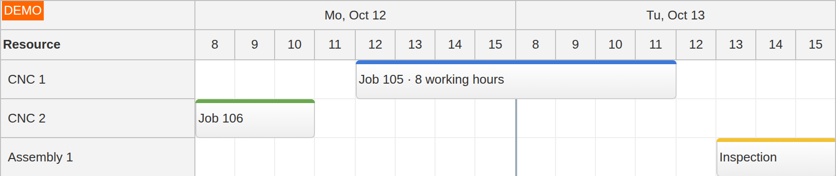
Separators can mark each break, so readers see where the time axis skips. The same mechanism can exclude any set of cells and build a fully custom time axis (see Timeline and Views).
Resource Grouping
Arrange rows by team, location, or any resource field in a tree whose parent rows can stay in view while their children scroll.
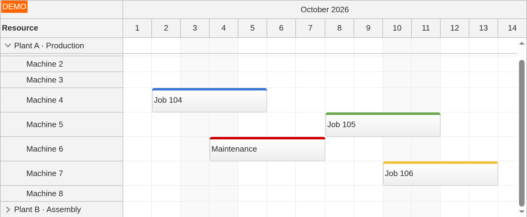
The grouping scheme comes from your resource data. Groups can start collapsed and load their children on first expand, so a large operation opens with a short list of branches instead of the full resource set. A parent row can act as a heading rather than a bookable resource.
Read how to keep parent rows visible while scrolling.
Row Headers
A header cell can hold a calculated value, an inline edit, a status icon, or a button wired to the resource.
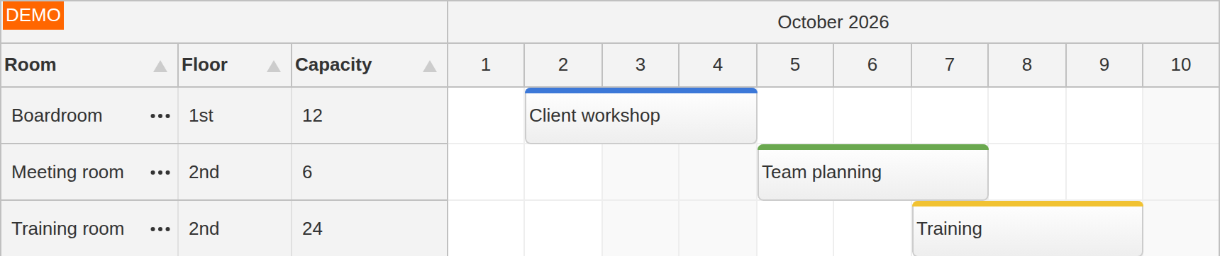
Row header columns display resource fields beside the schedule: code, location, capacity, status. The columns support sorting, resizing, filtering, and independent horizontal scrolling: additional columns scroll within a fixed-width header area. Users can show and hide columns from a header context menu, and the column width can auto-fit its content.
Header cells can also carry menus. One tutorial adds a header-cell icon that scrolls the row to its next free slot. Rows themselves can be created, edited, reordered, and filtered directly in the UI.
Follow the find-next-free-slot tutorial to add that action to a row header.
Frozen Rows
Pin a row to the top or bottom for totals, capacity, or an unassigned queue that stays aligned with the same time axis.
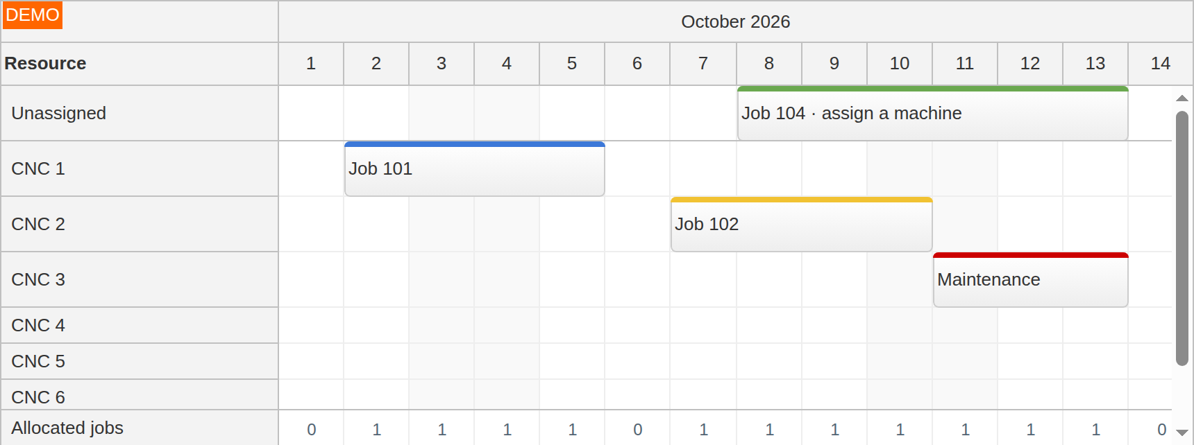
A frozen row can hold work whose dates are set but whose resource is still unassigned. Your application supplies these events or the values for a summary row. Totals, availability, and bookings line up under the same time headers.
A frozen row can be interactive or not. A queue lane accepts drags in both directions; a summary row can be marked read-only so nobody books work into a total.
Build a pinned availability display with the column-summary tutorial.
Capacity and Utilization
Calculate peak capacity use in each time slot from overlapping events and compare it with the resource’s limit.
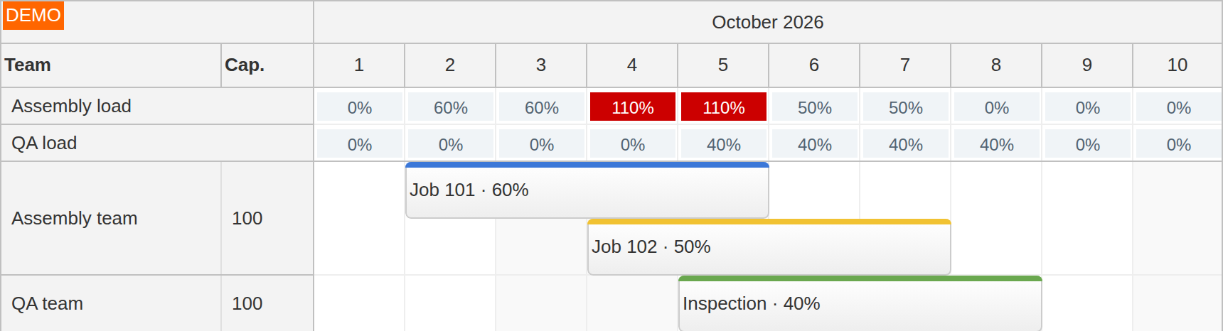
The utilization helper calculates the peak overlapping consumption from values in your event data. Your application supplies the resource capacity, compares the result with that limit, and renders a number, a bar, or a cell color. Drag validation can use the same capacity rules to reject a move. You can also roll totals up through group rows or into a frozen summary row.
Utilization can appear as a chart in the row header or as an availability histogram at the top of the grid.
Follow the resource-utilization chart tutorial.
Progressive Rendering and Dynamic Loading
Row headers, events, and time headers can render near the viewport as the user scrolls through a large board.
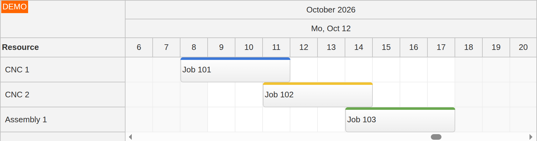
Progressive row-header and event rendering are available in both Lite and Pro. Pro also renders time headers as they are needed, reducing the initial work for long timelines.
Rendering and data loading can be configured separately. With dynamic loading, your application fetches events for the requested date window. Resource trees can load their children on expansion, and infinite scrolling requests new date windows as the user moves through the schedule. The performance demos let you compare these options with large resource lists and event sets.
Compare approaches in the large-data-set guide.
Dependency Links
When an event is dragged, shadow copies of its dependency links follow the drag, so the effect on linked work is visible before the drop.
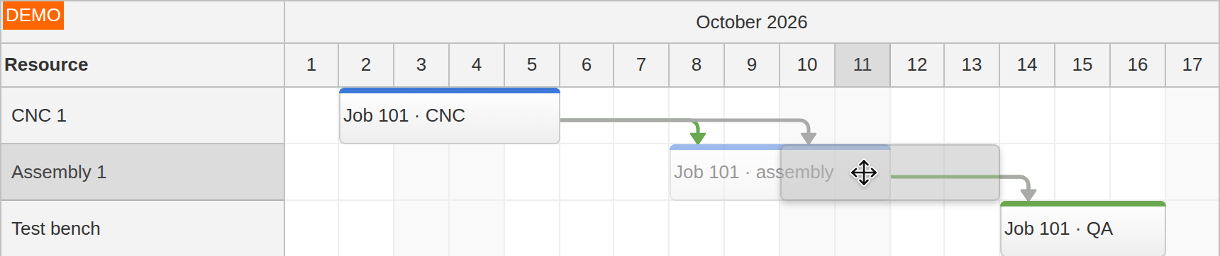
Users create a link by dragging from one event to another; your application loads and saves it like any other record, with a type from finish-to-start through start-to-finish. On screen, SVG links route as curves or right angles, carry labels and colors, and open bubbles and context menus. Events can be styled according to the links that touch them, so work waiting on an unfinished predecessor is visually distinct.
Links can connect an employee’s shift with its assignment at a location, show the order of steps in a production workflow, or represent travel time between field-service jobs. The Scheduler stores and draws the links; computing critical paths or re-planning automatically stays in your application.
Build a board with linked jobs using the field-service scheduling tutorial.
Milestones, Phases, and Progress
Events render as bars with your own colored phase segments and percent-complete fills, or as zero-duration milestones for key dates.
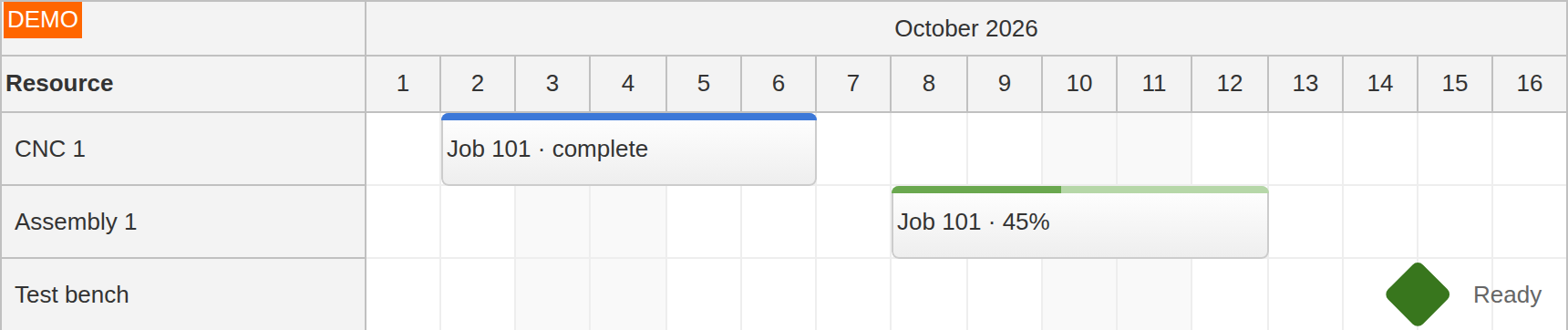
The duration bar and event icons can carry additional status, so a scan down a resource row reads as a status report without opening anything. Milestones support custom shapes, icons, and colors, and they can be connected to surrounding events using links.
Read how to display multiple phases within an event.
Planned vs Actual
Keep the planned dates visible in a read-only bar while users move or resize the current task.
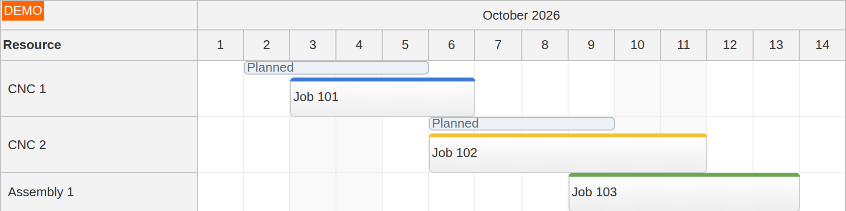
A late start, an overrun, or an early finish is visible directly on the row, without comparing timestamps. Your event data supplies the baseline dates; its bar can be faded, striped, or offset above or below the live event. Version bars share the current event’s resource row.
Follow the planned-versus-actual tutorial for Next.js.
Event Customization
The event box can hold icons, buttons, progress, custom controls, and framework-rendered content.
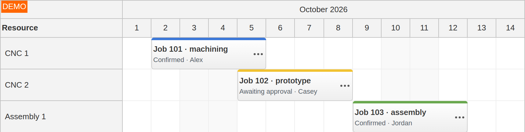
Events, cells, and headers are customizable through pre-render hooks, with the data exposed for your application to modify: content, colors, duration bar, and per-event interaction locks. Active areas add positioned elements inside events and cells: status icons, action buttons, progress marks, delete corners, and custom drag handles, each placed by pixel or by time within the box, handling its own clicks, and shown always, on hover, or in a touch-visible variant.
When markup is not enough, events render framework content directly: JSX in React, templates in Vue, and Angular templates or components in Pro. Inline event editing turns a click on the event text into an in-place editor, and the event tooltip shows details on hover.
See the event customization guide for content, controls, and progress displays.
User Experience Helpers
Bubbles, context menus, filtering for events and rows, a message bar instead of modal dialogs, and keyboard access.
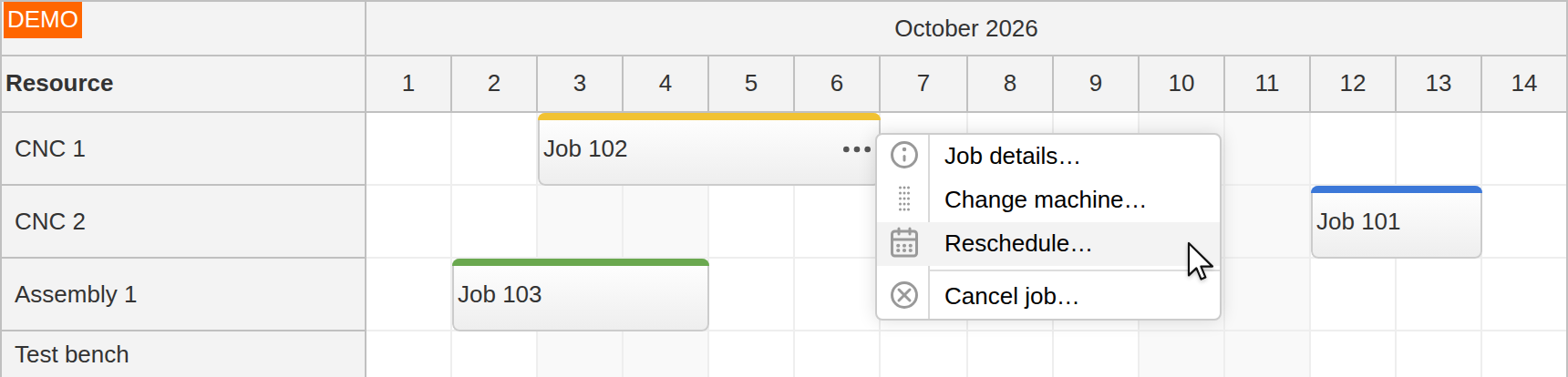
These helpers keep the default view compact while details and actions appear when needed:
Bubbles show details for events, cells, rows, links, and time headers
Context menus open on the exact event, time range, cell, row, or link under the pointer
A message bar confirms saves, moves, and deletes; a loading label reports background work
Event and row filtering reduce a full board to one crew, one status, or one search term
Keyboard access covers cell focus, time-range selection, and event editing
Floating event labels stay readable while long bars scroll, including custom React, Vue, and DOM content
Read the interaction and feedback guide.
Mobile and Touch
Event-box controls can appear on hover on desktop or stay permanently visible on touch, including finger-sized drag and resize handles.
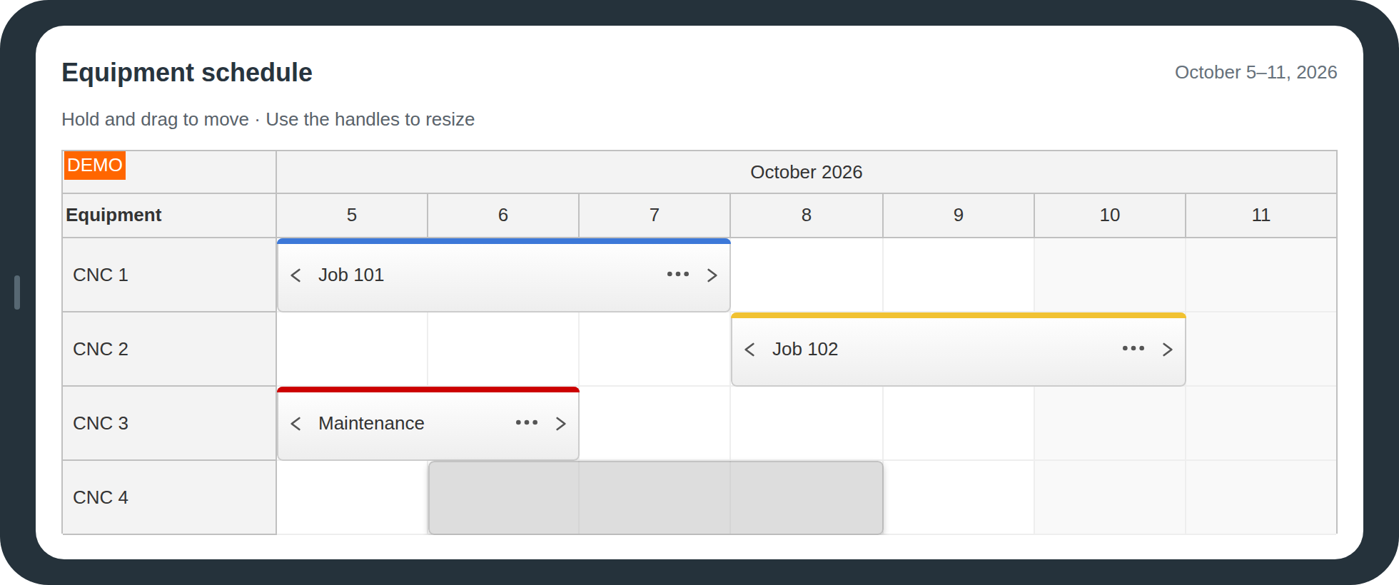
These controls are active areas, which can also serve as menu triggers. The touch gestures map directly: tap to select or open, tap-and-hold to start a move or a time-range selection, and touch drag to move and resize, with auto-scrolling near the viewport edge.
The Scheduler runs in responsive web applications on iOS and Android in standard mobile browsers; on desktop it supports Chrome, Safari, Firefox, and Edge.
Start with the mobile interaction guide, or build the touch-friendly sample application.
Internationalization
Built-in and custom locales, independent first-day-of-week and time-format settings, and RTL.
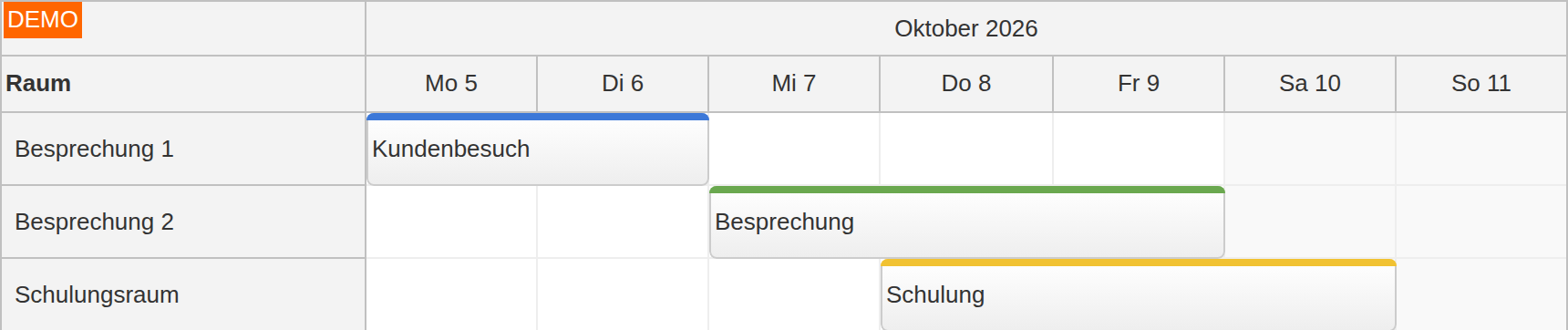
The locale property applies name and date/time formatting for major languages, and you can register custom locales when the bundled set is not enough. The operational settings stay independent: first day of week, time format, and the header date format are separate properties, so a board can format for one region, force 24-hour time because the operation runs on it, and still start the planning week on Monday. Right-to-left layout is supported for RTL languages, including the context menu and bubbles.
Read the internationalization guide.
Themes and Visual Styling
A theme is a standard CSS file: choose a supplied theme, tune the variables, or generate one in the Theme Designer.
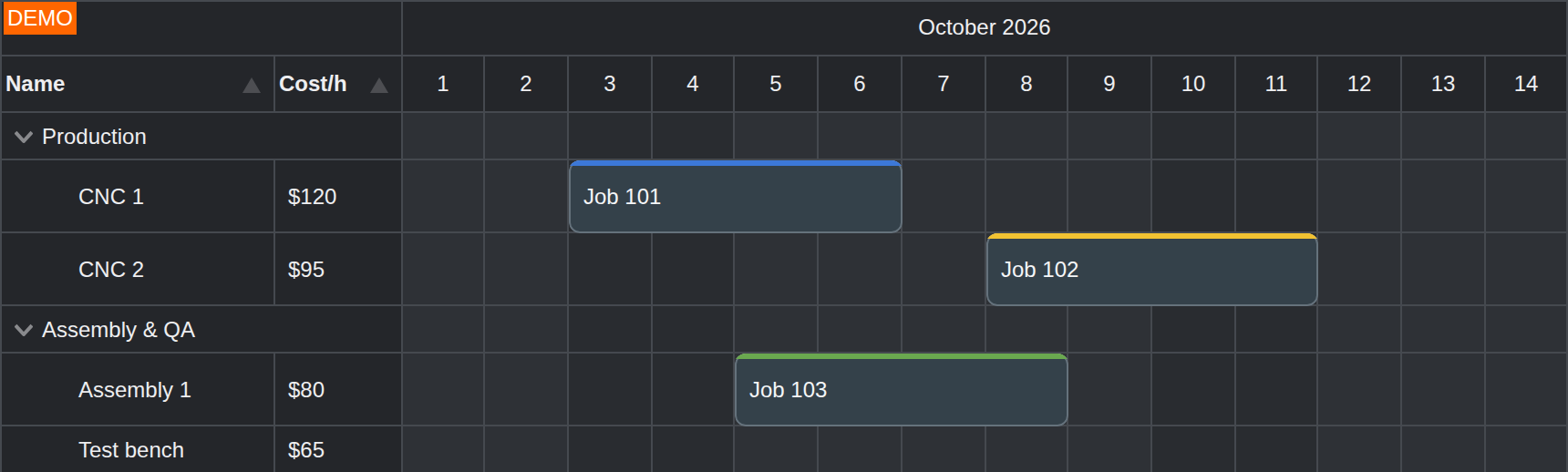
The default theme is embedded, so a first board needs no separate stylesheet. A supplied dark theme is available as a separate CSS file. CSS variables control common values, and CSS classes remain available for direct editing. Preview your changes in the Theme Designer, then download the stylesheet to keep in source control. The same theme language covers Scheduler, Calendar, Month, Gantt, Kanban, and Navigator.
Read the theme configuration guide.
Export
Export the whole board or a chosen date range as SVG, PNG, JPG, paginated PDF, or an XLSX that keeps the board's structure.
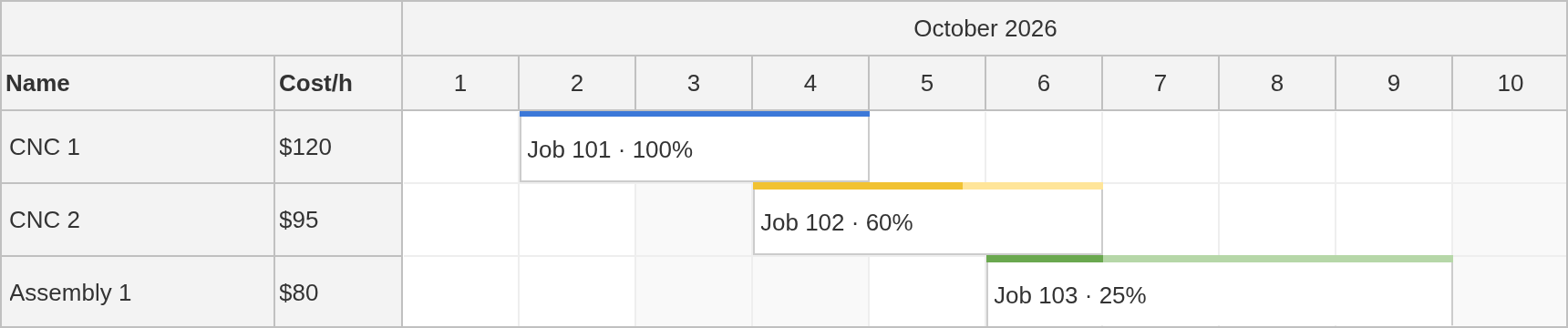
Export runs on the client and renders the schedule from its data:
SVG: vector output that stays sharp at any zoom or print size.
PNG and JPEG: raster snapshots for quick handoff.
PDF: composed output with page size, orientation, and headers.
Excel (XLSX): the spreadsheet keeps row header columns, frozen rows, colors, and event phases.
Printing: through the browser for the quick case.
One thing to plan for: custom on-screen HTML does not become export content automatically. Where an event, cell, or header uses your own rendering, you provide the export version of that element.
Scheduler UI Builder
Configure a live Scheduler in the browser and download a runnable project for your stack.
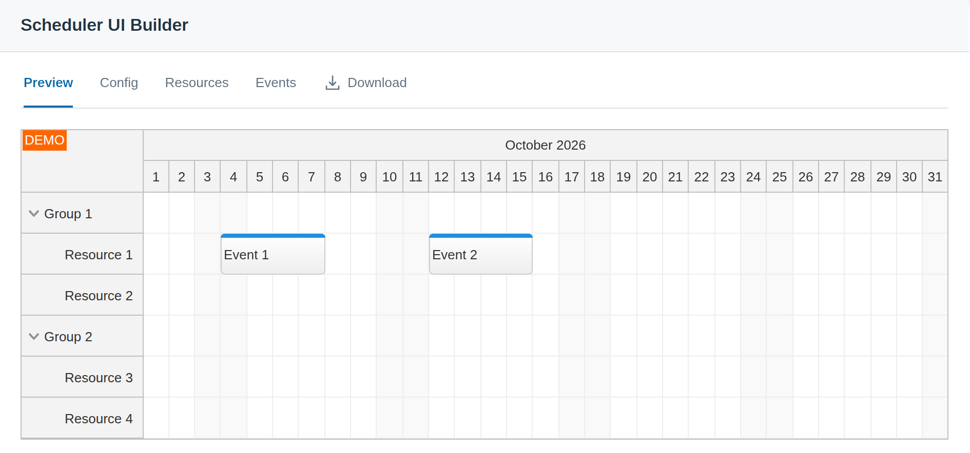
The Scheduler UI Builder assembles a working configuration visually: set rows, scale, headers, and behavior against a live preview, then download a runnable starter project for JavaScript, TypeScript, Angular, React, Vue, or Next.js. The configuration can be edited by hand later, once there is something on screen to react to.
For development with a coding assistant, the DayPilot MCP server provides official documentation lookup, package selection, theme generation, and starter projects from the UI Builder.
Read the rapid-prototyping guide for a practical route from configuration to a working application.
Tutorials and Sample Apps
More than 200 tutorials cover shift planning, work orders, production scheduling, field service, reservations, and timesheets, each with source code.
The tutorials include downloadable projects and cover complete applications as well as individual scheduling features:
Shift planning and multi-location scheduling
Work orders and dispatch with an unscheduled queue
Machine and production scheduling with dependencies
Field service with routes and travel time
Hotel booking, restaurant, court, and equipment reservations
Annual leave planning and timesheets
Open-source starter tutorials are available for Angular, React, and Vue. Other examples cover Next.js and backends in PHP, ASP.NET Core, Spring Boot, Node.js, and Laravel.
Browse the Scheduler tutorial library.
Small Footprint
One self-contained core, no required third-party dependencies, and optional libraries only where the feature needs them.
The Scheduler core does not bundle a date library, a drag-and-drop package, or a framework runtime; the same self-contained engine runs from plain JavaScript and from the Angular, React, and Vue packages, which add only their own framework peers. Optional libraries load only where a feature needs one: ExcelJS for Excel export and jsPDF for PDF composition, and only when your application uses those export paths.
The result is a short dependency list, and the bill of materials page keeps it public.
Read the dependencies and packaging guide.
Stable API and Regular Release Cycle
DayPilot Pro normally releases on the 1st and 15th of each month, with additional fixes when needed and API changes documented in the notes.
We aim for backwards compatibility so upgrading can be easy. The release notes describe new features, fixes, and API changes; the API reference documents the configuration options and event handlers used by your application.
See Also: Related Components
Calendar, Gantt, and Month solve neighboring layouts; choose by how time and resources are arranged.
Scheduler is one member of the DayPilot scheduling family. The right component depends on the shape of the board:
Scheduler: time runs horizontally, resources are rows. Best for resource planning over long horizons with many rows.
Calendar: time runs vertically, days or resources are columns. Best for day and week appointments at hour or minute resolution.
Gantt: task rows with dependencies. Best for project-style planning where task structure leads.
Month: a month-first overview where the date is the primary axis.