 DayPilot
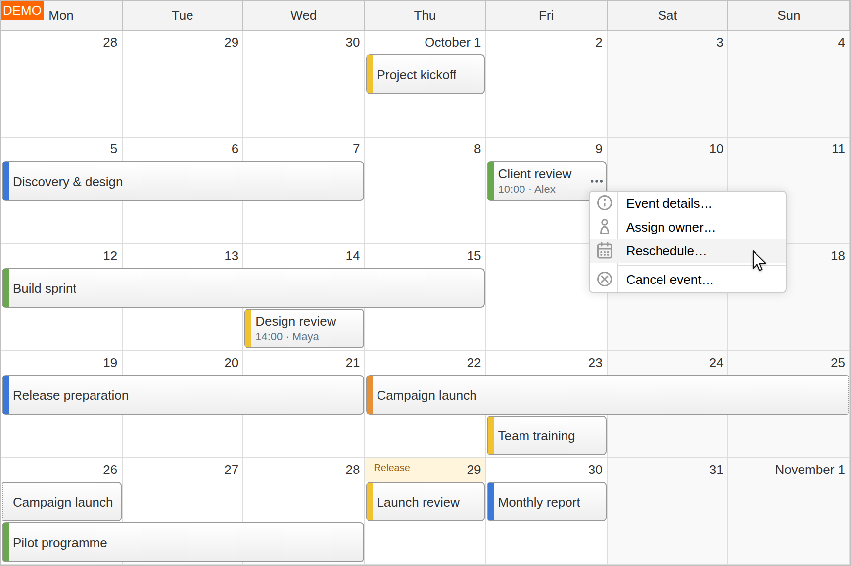
The JavaScript monthly calendar displays appointments, deadlines and multi-day plans in a familiar grid of dates. Use it for team activities, maintenance visits, training calendars and project schedules where the month matters more than an hourly timeline.
Try the interactive Month demo or download DayPilot Pro. DayPilot Month is also available in the open-source Lite edition. Lite covers the core monthly calendar and event editing; Pro adds features such as multi-week views, detail bubbles, advanced date customization and export. The screenshots show Pro; the Lite and Pro feature matrix provides the full comparison.
Multi-day Plans and Timed Appointments
Keep longer activities and individual meetings in the same calendar.
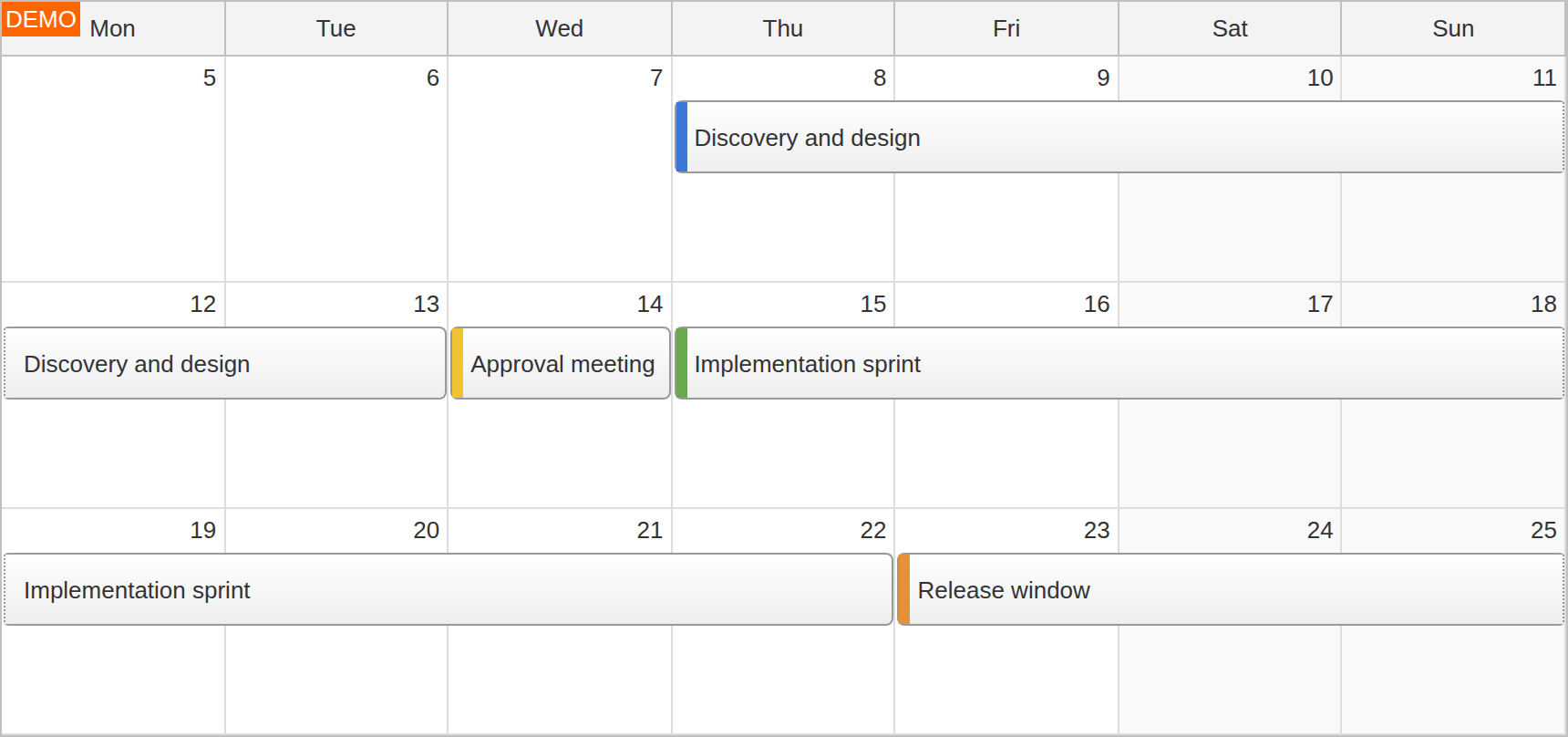
Events can occupy one date or span several days, continuing across week rows when needed. Timed appointments keep their start and end values even when the calendar presents them within a single date. Show time labels alongside the event text, or use custom content for a title, owner and status.
Week rows can grow to fit the events. For denser calendars, limit the displayed event lines and provide an application action for the remaining items. The more-events tutorial demonstrates that combination.
Drag and Drop Editing
Change a plan directly in the date grid.
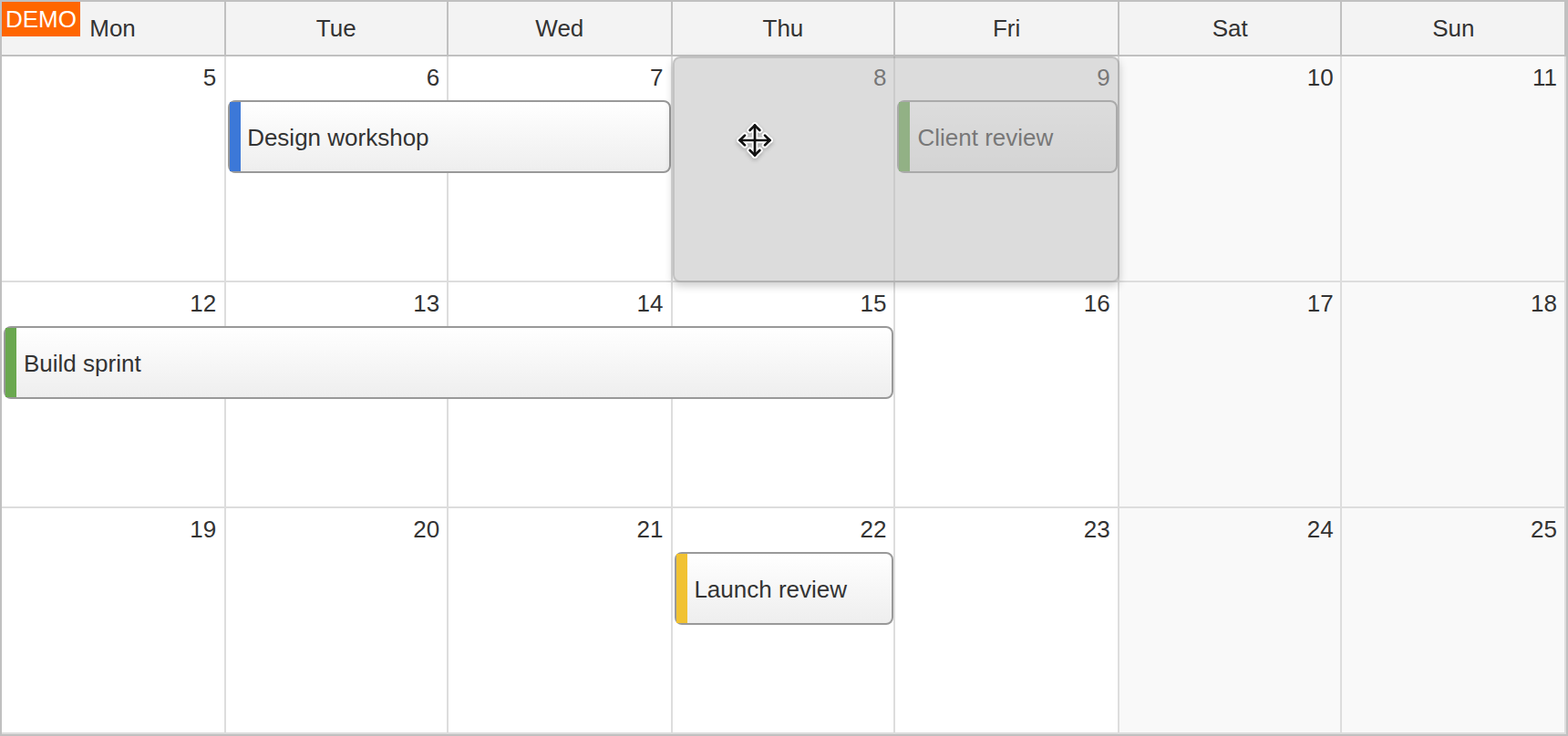
Select dates to create an event, drag an event to move it to new dates, or drag its edge to change its duration. External draggable items can represent work waiting to be scheduled.
Before-action handlers can reject a move or resize; after-action handlers can save the accepted change. Your application supplies the dialogs, permissions and backend updates. The event-click handlers can open an editor without requiring a drag operation.
Event Details and Application Actions
Make the useful information visible and keep longer details within reach.
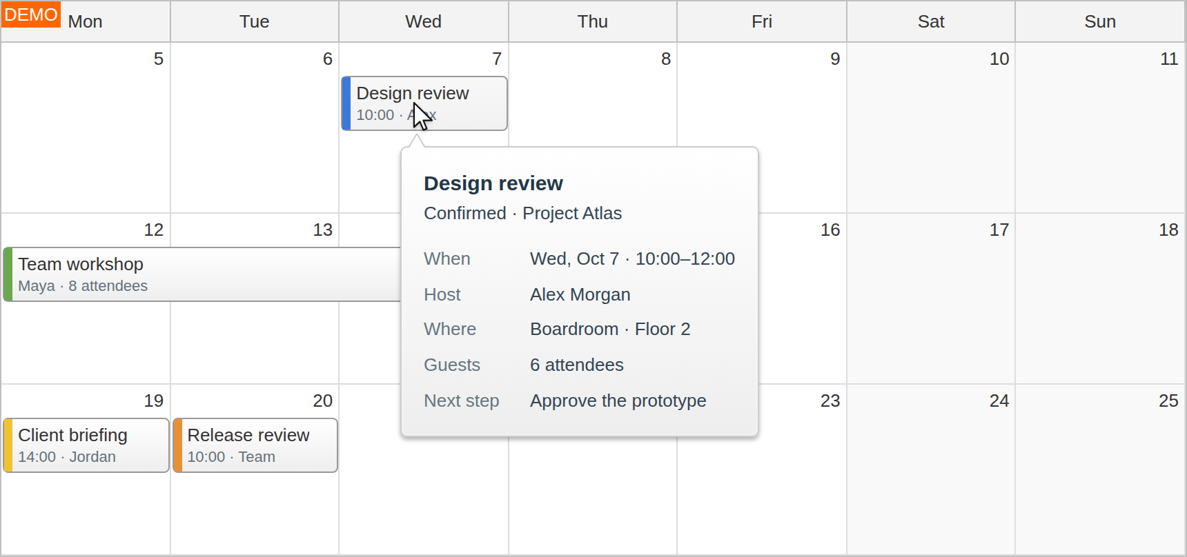
Use custom event content, colors and action icons to show categories, owners, locations or confirmation status. A visible menu button can offer actions such as editing details, assigning an owner or rescheduling.
A Pro event bubble displays additional information on demand and can load it asynchronously. Event menus and active areas are available in both current Lite and Pro editions; their actions connect to your application logic.
Month Ranges and Date Navigation
Show a whole month or a focused range of weeks.
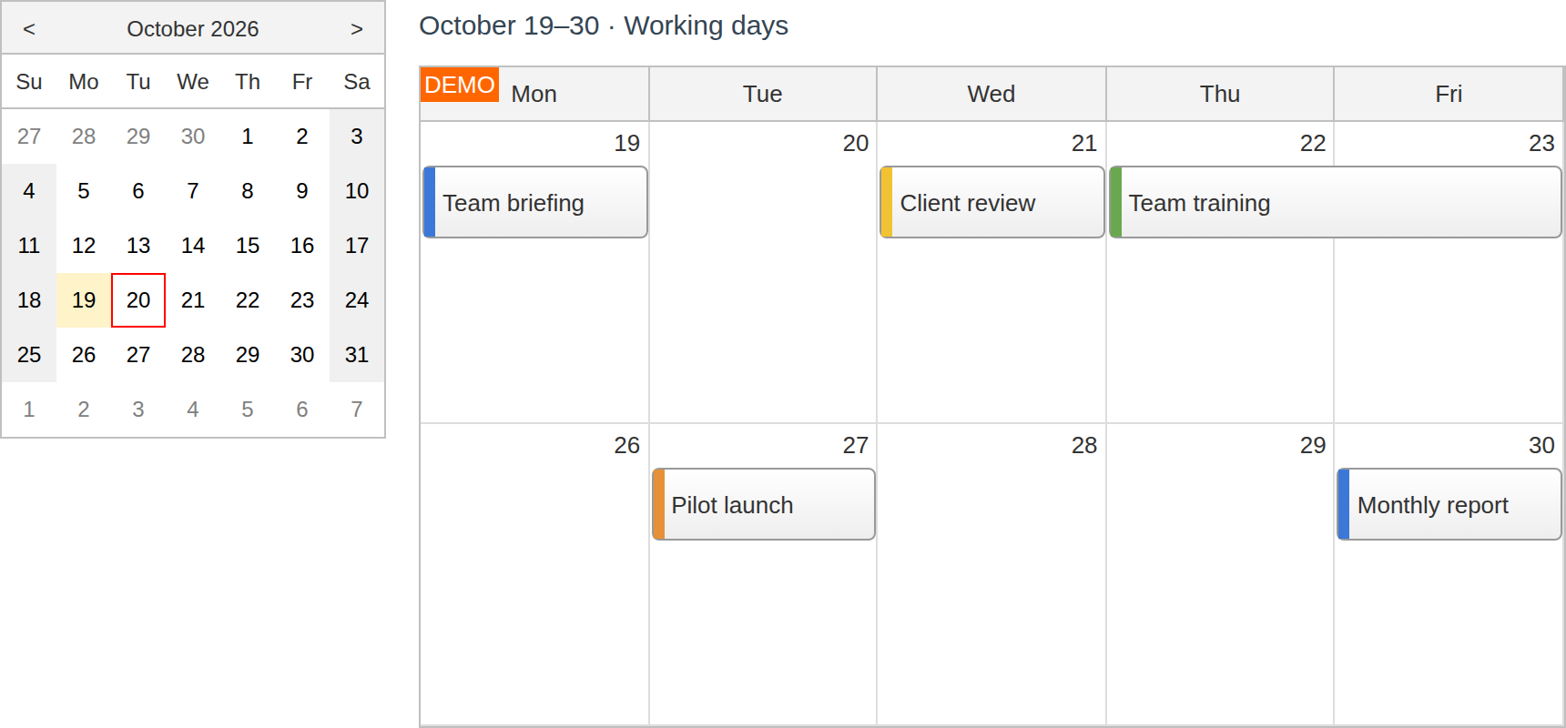
The standard month view includes complete week rows and neighboring-month dates. Pro also supports a configurable multi-week range, with weekends shown or hidden. The example combines two working weeks with a Navigator date picker.
Add previous/next controls or connect a Navigator to change the visible date range. For an application that switches between hourly day/week views and Month, combine it with the Calendar component. Weekday-header clicks can provide another application navigation action.
Date and Cell Customization
Give deadlines and unavailable dates a clear place in the plan.
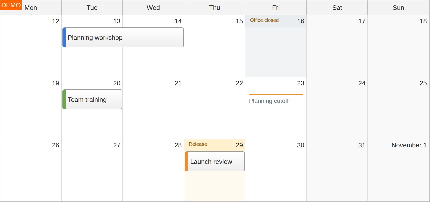
Customize date cells and weekday headers with application labels, backgrounds and other content. Pro cell active areas can add a deadline note or a date-specific action.
Mark unavailable dates so users cannot create, move or resize events onto them. Existing events remain visible. Keep the business rules in your application when availability depends on more than the displayed date.
Data Loading and JavaScript Setup
Start with matching dates, then connect the calendar to your data.
This complete example displays October 2026, loads a multi-day plan and a meeting, and uses the entered name when a user selects dates to create an event:
<script src="daypilot-all.min.js"></script>
<div id="dp"></div>
<script>
const dp = new DayPilot.Month("dp", {
  startDate: "2026-10-01",
  eventHeight: 40,
  onTimeRangeSelected: async (args) => {
    const modal = await DayPilot.Modal.prompt("Event name:", "New event");
    dp.clearSelection();
    if (modal.canceled || !modal.result?.trim()) return;
    dp.events.add({
      id: DayPilot.guid(),
      start: args.start,
      end: args.end,
      text: modal.result.trim()
    });
  }
});
dp.init();
dp.update({
  events: [
    { id: "plan", text: "Discovery and design",
      start: "2026-10-05", end: "2026-10-08" },
    { id: "review", text: "Client review",
      start: "2026-10-09T10:00:00", end: "2026-10-09T11:00:00" }
  ]
});
</script>
With the default end-date behavior, event ends are exclusive: the plan above occupies October 5–7. Use update({events}) to replace the collection or the client-side event API to add, update and remove individual events.
The event-loading API can request JSON for the full visible date range, including dates from neighboring months. Load again when your navigation changes that range. The JavaScript/PHP monthly calendar tutorial connects these operations to stored event data.
JavaScript, TypeScript and Framework Integration
Use the monthly view in your application's stack.
DayPilot provides JavaScript, Angular, React and Vue packages with TypeScript declarations. Use the official Pro package links or the Lite installation options for your framework. Follow the React Month tutorial, Angular day/week/month project or Vue day/week/month project for a working integration.
Pro Angular templates support custom event and cell content. The open-source ASP.NET Core maintenance calendar shows another practical use of Month, with colored maintenance events and application checklists. The Month documentation and Month API reference cover the component's configuration and callbacks.
Month UI Builder
Configure a live calendar and download a starter project.
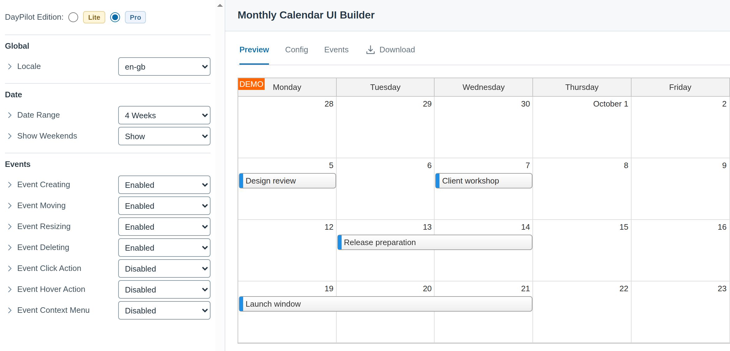
The Month UI Builder provides a working preview while you choose the date range, weekends and interaction options. Download a JavaScript, TypeScript, Angular, React, Next.js or Vue starter and extend it with your event data and application behavior.
Mobile and Touch Interaction
Keep date-based planning available on a tablet.
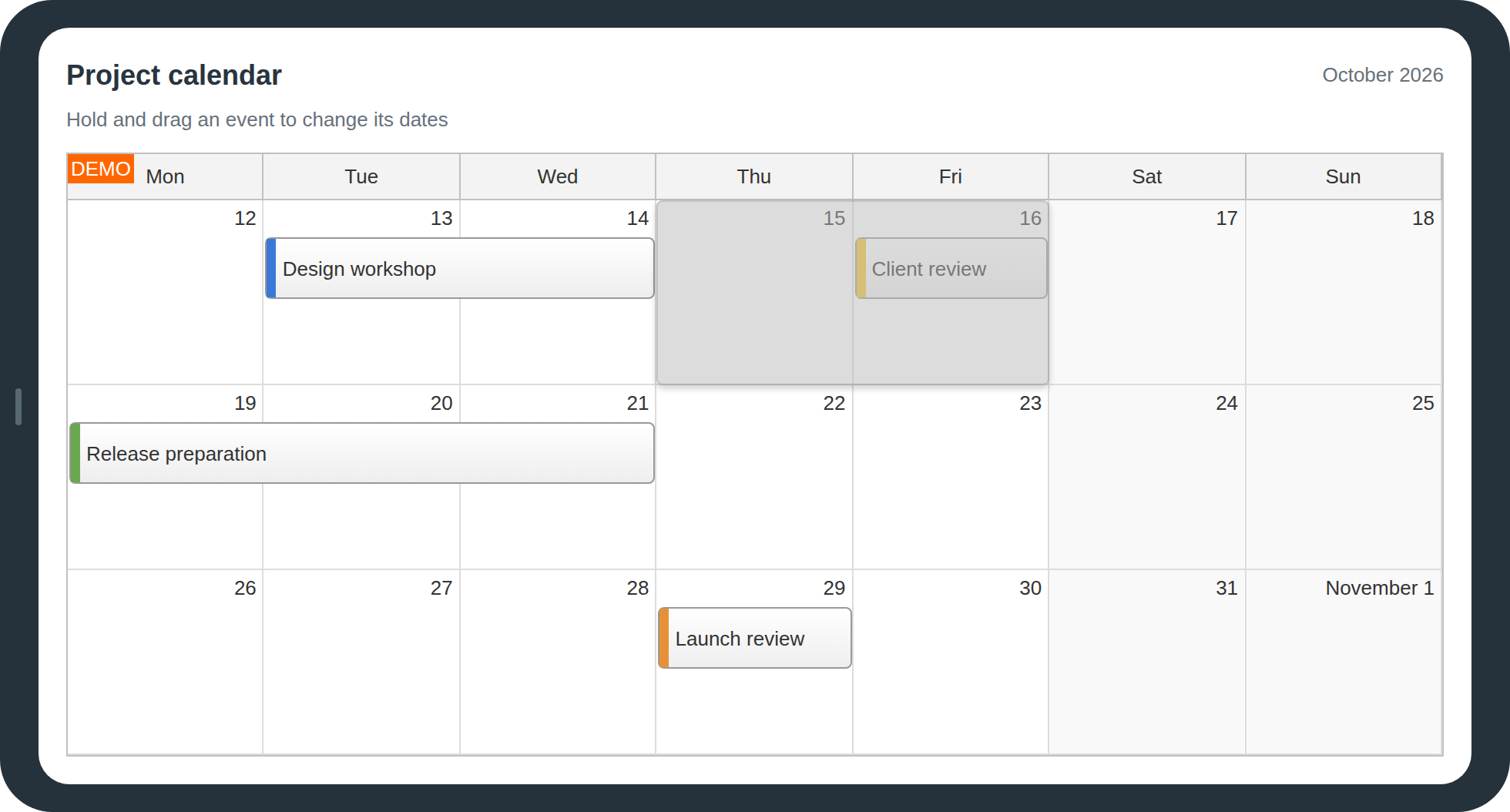
Pro supports touch interaction for tapping events, selecting dates and holding an event to move it. Visible action icons keep menus available without relying on hover. The landscape example shows an actual held event move.
External drag and drop also supports touch input for scheduling items from outside the calendar. Check the browser compatibility matrix for your target environment.
Themes and Localization
Match the application and its date conventions.
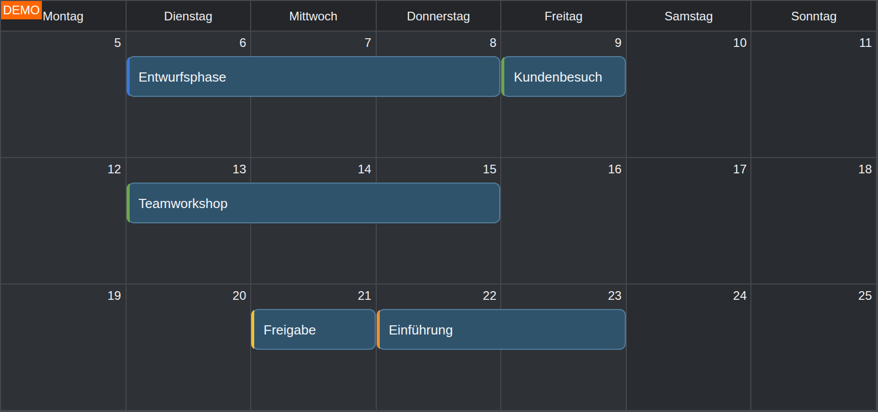
Use the native light appearance or load a Month CSS theme, including the current dark theme. The Theme Designer provides a visual starting point for colors, borders and fonts.
Locale settings control weekday names, date formatting and the default first day of the week. Event text and application labels come from your data. The example combines the native dark theme with German weekday labels and event text.
Export Images, PDF and Excel
Share the calendar beyond the interactive view.
Pro image export produces PNG, JPEG or SVG output for reports and printing. Embed an exported image in an application-generated PDF; the monthly calendar PDF tutorial shows that workflow.
XLSX export uses a separately supplied ExcelJS library and exports the full calendar grid, including overlapping and multi-day events. Spreadsheet output has its own formatting options; custom HTML, action areas and CSS effects are not reproduced as an identical image.