 DayPilot
Release date: October 15, 2026
Performance optimizations
Faster Scheduler rendering with large resource lists
This release improves progressive row-header rendering when the Scheduler displays many resources. Creating and removing row headers during scrolling takes less work, and disposing the Scheduler is faster when switching views or leaving a page with a large resource list.
Progressive row rendering is enabled by default, so existing applications benefit without new configuration. It renders row headers near the visible viewport instead of creating all headers at once. Use progressiveRowRenderingPreload to adjust the extra rows prepared above and below the visible area.
Try the updated progressive row rendering demo with up to 100,000 rows, grouped resources, and plain, rich, or interactive row headers. Jump between the beginning, middle, and end of the resource list. At 10,000 rows or fewer, you can also switch progressive rendering off to compare the behavior.
Explore long Gantt timelines
The new Gantt progressive time headers demo makes it easier to explore the progressive time-header rendering introduced in the previous release. Choose timeline presets up to three years, compare rendering modes, and navigate to the start, middle, or end of the timeline.
Features
Angular templates
Customize DayPilot content directly in your Angular component template using ng-template and the new daypilotTemplate directive. Templates can contain Angular bindings, event handlers, and child components, so you can reuse your application's UI inside events, cells, and headers.
The Angular Scheduler supports templates for events, cells, row headers, time headers, and the corner. The Angular Calendar supports events, cells, column headers, and time headers; the Angular Month supports events and cells. You can also customize day cells in the Angular Navigator and tasks and row headers in the Angular Gantt.
For example, add an event template inside an existing Scheduler. The let-event="event" declaration exposes the event to your markup:
<daypilot-scheduler [config]="config" [events]="events">
  <ng-template daypilotTemplate="event"
               daypilotTemplateFor="scheduler"
               let-event="event">
    <strong>{{ event.text() }}</strong>
  </ng-template>
</daypilot-scheduler>
The directive is exported by DayPilotModule in daypilot-pro-angular. The optional daypilotTemplateFor attribute selects the component's template context for Angular type checking. This is useful for template names, such as cell, whose context differs between components.
Dark themes
New CSS themes give Scheduler, Gantt, Calendar, Month, and Kanban a dark appearance. The interactive demos show dark headers and backgrounds with colored events or cards, so you can see how the theme works with typical scheduling data.
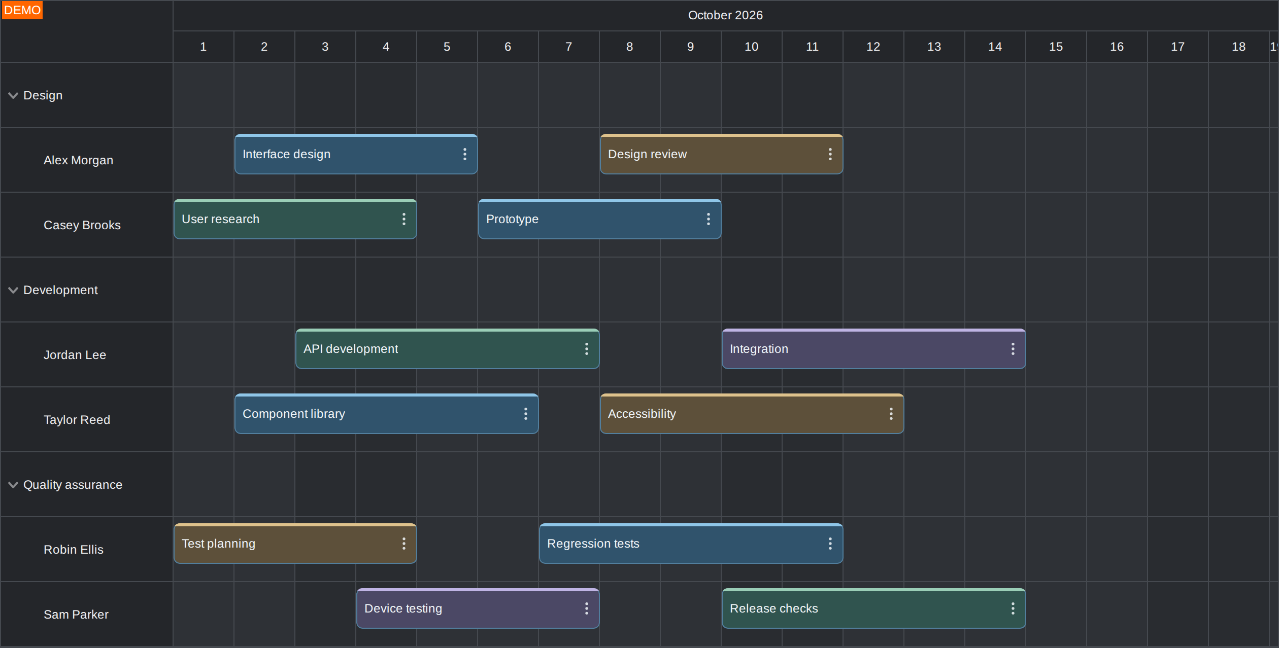
To use the Scheduler theme, include scheduler_dark.css from the distribution and set the theme property to "scheduler_dark":
<link rel="stylesheet" href="themes/scheduler_dark.css">Apply the theme to an existing Scheduler:
scheduler.update({
  theme: "scheduler_dark"
});
The update() method applies the new theme without recreating the Scheduler. You can also set theme in its initial configuration.
Try the dark theme demos: Scheduler, Gantt, Calendar, Month, and Kanban.
Scheduler: Separators for individual resources
Scheduler separators can now mark a date and time in a single resource row. Use them for a room-specific checkpoint, a machine inspection, or a deadline that applies to one resource. Set the resource field of an item in the separators array to the resource ID. Omit it to keep a separator that spans the full schedule.
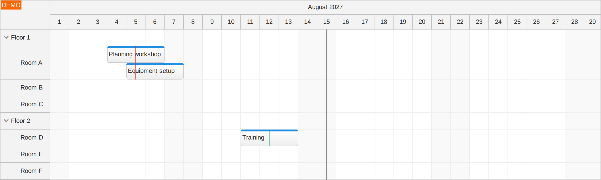
For example, the following configuration adds a gray review line across the schedule and a red checkpoint only in the row with resource ID "A":
separators: [
  {
    location: "2027-08-15T12:00:00",
    color: "#888888"
  },
  {
    location: "2027-08-05T12:00:00",
    color: "#dc2626",
    resource: "A",
    layer: "AboveEvents"
  }
]
Each resource separator stays within its row and follows changes in row height and visibility. A separator assigned to a parent resource appears in the parent's own row. The "AboveEvents" layer keeps the red checkpoint visible over bookings in this example.
Try the separators demo: collapse a floor or create overlapping bookings to see the lines follow their rows.
DayPilot MCP server
The new DayPilot MCP server connects your coding assistant to official DayPilot developer tools. Use it to find an API or example while working on an existing application, create a CSS theme, or generate a starter project with DayPilot UI Builder.
Find documentation and examples: Search official guides, API references, tutorials and demos, then read the relevant content directly in your assistant.
Choose packages: Resolve the latest Lite or Pro package for JavaScript, Angular, React or Vue, including installation and license guidance.
Create themes: Inspect the available theme settings and generate CSS with your own class prefix.
Start a project: Discover Builder options, validate a configuration and generate a downloadable starter project.
Add the following endpoint to a coding assistant that supports remote MCP over Streamable HTTP:
https://mcp.daypilot.org/mcpFor example, after connecting, ask: “Find the Scheduler API for coloring events and show how to use it in my React application.” For a new project, try: “Create an Angular Scheduler starter using DayPilot Pro.”
The public tools require no DayPilot account or license key. Your assistant applies changes to your project; check them against your installed DayPilot version. DayPilot Pro licensing still applies to production applications.
See the connection guide for client setup and the AI-assisted development guide for workflows and examples.
Improvements
Scheduler
- Improve progressive row-header rendering and disposal performance with large resource lists. (2026.4.7098)
- Update the progressive row rendering demo with up to 100,000 rows, grouped resources, and rich and interactive row headers. (2026.4.7098)
Gantt
- Add a Progressive Time Headers demo with timeline presets up to three years, a progressive rendering toggle, and navigation to the start, middle, and end. (2026.4.7104)
- Update the Links demo with right-angled SVG links and controls for linkShape, linkWidth, linkArrowSize, and linkHitAreaMinWidth. (2026.4.7104)
General
- Add direct Theme Designer customization links to generated-theme demos. (2026.4.7100)
Fixes
Scheduler
- Fix an error when pressing Enter before a cell or event has keyboard focus. (2026.4.7095)
- Fix automatic row header sizing when React components render after the initial width measurement. (2026.4.7096)
- Fix row header width changes during tree expansion by measuring headers before animation starts. (2026.4.7096)
- Fix stale event occurrences after updates or inline editing when multiple main grid rows share a resource ID. (2026.4.7097)
- Fix an Enter-key exception and incorrect modifier state when keyboardTarget is set to
"component". (2026.4.7097) - Fix rendering errors with fractional progressiveRowRenderingPreload values. (2026.4.7098)
- Fix link creation handle positioning and drag previews in RTL mode. (2026.4.7102)
- Fix the invisible preview when creating event links using drag and drop with the default theme. (2026.4.7102)
Gantt
- Fix initialization and grid mouse-down errors when using separately minified scripts. (2026.4.7092)
Calendar
- Fix column resizing errors after scrolling when columnWidthSpec is set to
"Fixed"(regression). (2026.4.7093)
Month
- Fix duplicate onTimeRangeSelect and onTimeRangeSelected callbacks for a single selection gesture. (2026.4.7107)
- Fix duplicate onTimeRangeDoubleClick and onTimeRangeDoubleClicked callbacks caused by event bubbling. (2026.4.7107)
Kanban
- Fix duplicate card elements after moving cards between columns or swimlanes. (2026.4.7108)
General
- Restore focus to the opener when a Modal closes, preserving application focus overrides. (2026.4.7097)
- Associate generated Modal text fields with their visible labels. (2026.4.7097)
- Fix Angular template context type checking when
daypilotTemplateForis omitted. (2026.4.7108)
API Changes
Scheduler
- Change the default value of linkCornerRadius from
0to6. Right-angled links now use rounded corners by default; set linkCornerRadius to0to retain square corners. (2026.4.7094)