The resource calendar component displays calendar data (events or appointments) for multiple resources (people, rooms, cars, tools) side by side. The resources are displayed as columns; each columns displays up to 24 hours.
JavaScript Calendar with Resources as Columns
In the default view, the JavaScript calendar component displays days as columns (on the horizontal axis). If you need to display a calendar for multiple resources side by side you can switch the calendar component to resources view. It the resources mode, the calendar will display resources as columns.
<script src="daypilot-all.min.js"></script>
<div id="dp"></div>

<script>
  var dp = new DayPilot.Calendar("dp");
  dp.viewType = "Resources";
  dp.columns.list = [
    { name: "Person 1", id: 1 },
    { name: "Person 2", id: 2 },
    { name: "Person 3", id: 3 },
    { name: "Person 4", id: 4 },
    { name: "Person 5", id: 5 },
    { name: "Person 6", id: 6 },
    { name: "Person 7", id: 7 }
  ];
  dp.init();
</script>
Resource Calendar with Groups
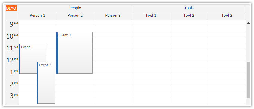
If you have many resources to display in the calendar, you can group them by displaying a column hierarchy. Define children for each calendar column and set the number of levels that you want to display:
<script src="daypilot-all.min.js"></script>
<div id="dp"></div>

<script>
  var dp = new DayPilot.Calendar("dp");
  dp.viewType = "Resources";
  dp.headerLevels = 2;
  dp.columns.list = [
    {id: "group_people", name: "People", children: [
      {id: "1", name: "Person 1"},
      {id: "2", name: "Person 2"},
      {id: "3", name: "Person 3"}
    ]},
    {id: "group_tools", name: "Tools", children: [
      {id: "4", name: "Tool 1"},
      {id: "5", name: "Tool 2"},
      {id: "6", name: "Tool 3"}
    ]}
  ];
  dp.init();
</script>
Calendar with Many Resources
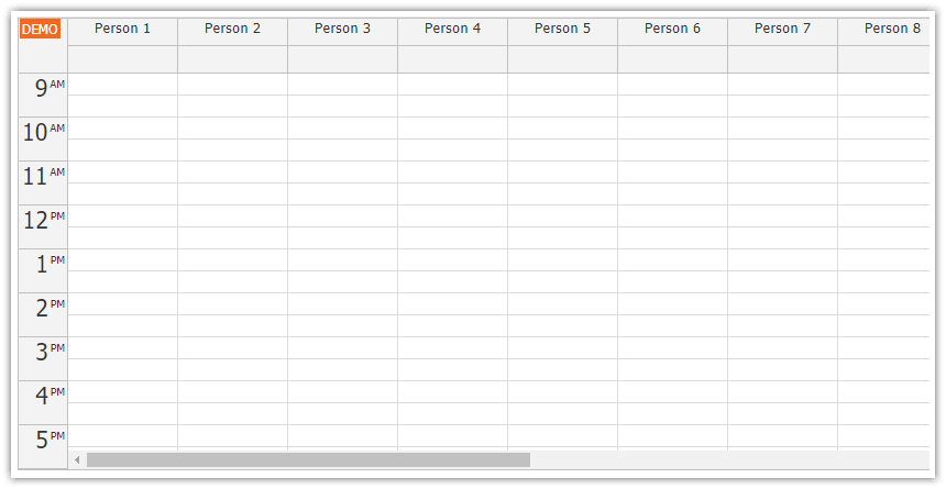
With the default settings, the width of the JavaScript calendar columns is calculated automatically to fill the available space. If you need to display a large number of columns, it’s possible to set a fixed column width. If the total column width exceeds the calendar with, a horizontal scrollbar will be added.
<script src="daypilot-all.min.js"></script>
<div id="dp"></div>

<script>
  var dp = new DayPilot.Calendar("dp");
  dp.viewType = "Resources";
  dp.columnWidthSpec = "Fixed";
  dp.columnWidth = 150;
  dp.columns.list = [
    { name: "Person 1", id: 1 },
    { name: "Person 2", id: 2 },
    { name: "Person 3", id: 3 },
    { name: "Person 4", id: 4 },
    { name: "Person 5", id: 5 },
    { name: "Person 6", id: 6 },
    { name: "Person 7", id: 7 },
    // ...
  ];
  dp.init();
</script>
Create a Resource Calendar Prototype in Minutes
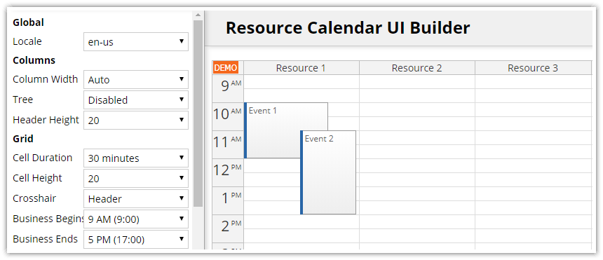
There are many configuration options available that will let you customize the resource calendar for your needs. You can test a preview the common settings using an online configurator. The Resource Calendar UI Builder application lets you configure the resource calendar and generate a ready-to-run project that includes all dependencies (HTML5/JavaScript, Angular and Vue.js projects are supported).
 DayPilot


