Release date: January 28, 2014 (build 7.7.644)
Default CSS Themes
This releases introduces a set of CSS themes that are built into the .js library.
It is no longer necessary to include an external stylesheet in order to display the control correctly.
You can still use another theme using .theme property - either one of those that are included in the DayPilot package (Transparent, White, Green, Windows 8, Blue, Traditional) or a custom theme built using the online CSS theme designer.
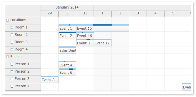
Scheduler CSS Theme (scheduler_default)
The default scheduler CSS theme uses gray header background, white cell background, light gradient for the event background and shades of blue for the duration bar (highlighting the). Resource tree node icons (no children, expanded, collapsed) are included. Special classes for floating scheduler time headers and floating events are included (a special overlay for objects that are not fully visible due to the scrollbar position).

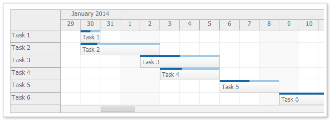
Gantt Chart CSS Theme (scheduler_default)
The default Gantt chart theme reuses the Scheduler CSS theme. The percent complete indicator uses the duration bar style (blue bars at the top of the task).

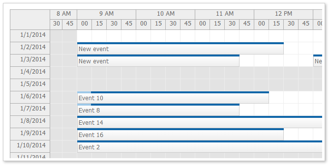
Timesheet CSS Theme (scheduler_default)
The default Timesheet theme reuses the Scheduler CSS theme. Weekend and other non-business hours use a special background color (light gray).

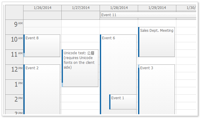
Calendar CSS Theme (calendar_default)
The event calendar theme uses rectangular corners a light CSS3 gradient for event boxes. The duration bar is displayed on the left side, using dark and light blue to indicate the real event duration. All day events use a simple box with a light gradient.

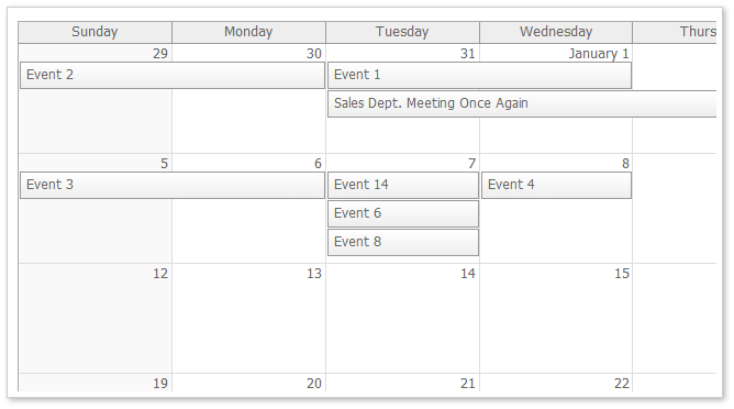
Monthly Calendar CSS Theme (month_default)
The default monthly event calendar theme uses a CSS3 gradient for event boxes. Weekends use a light gray background color.

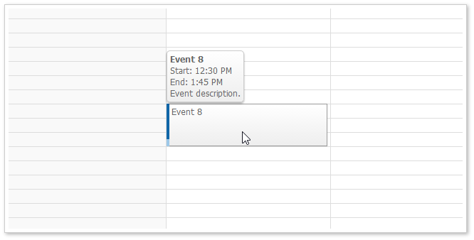
Event Bubble CSS Theme (bubble_default)
The event bubble displays event details in a hover box. It is a simple box with gray text and gradient background. It uses rounded corners to give the bubble a look different from the event boxes.

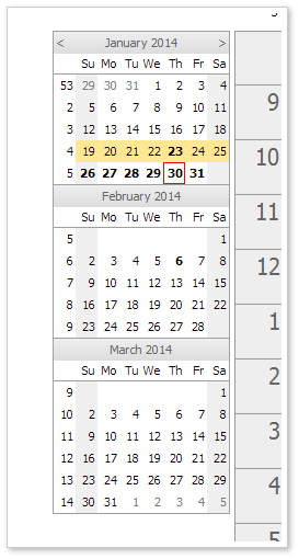
Navigator CSS Theme (navigator_default)
The navigator displays an outline of one or more months and allows the users to change a date displayed in the main HTML5 calendar widget.
The default theme uses a combination of white, black and gray. The selected date range is highlighted using a yellow background. The current date is highlighted using a red border.

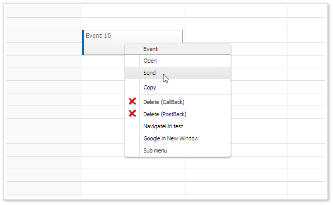
Context Menu CSS Theme (menu_default)

The date picker uses the navigator_default theme (it is based on the Navigator).
Automatic Cell Width (Scheduler)
It is possible to specify how the cell (column) width will be set using a new .cellWidth property. The previous version always used the value specified using .cellWidth property.
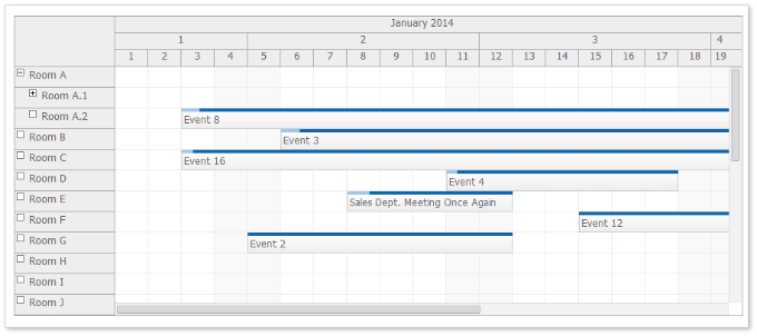
With 7.7 release, it is possible to adjust the cell width according to the current viewport size so the total width will match the Scheduler widget width.
Fixed Cell Width
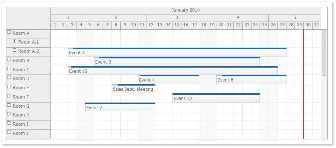
The default mode uses .cellWidthSpec="Fixed".

Auto Cell Width (cellWidthSpec="Auto")
You can use cellWidthSpec="Auto" to adjust the cell width automatically so the full Scheduler width is used.

Behavior:
- No free space on the right will be displayed.
- No horizontal scrollbar will be displayed.
- The .cellWidth property will be overwritten during the adjustment. It may use a decimal number.
- The width will be recalculated when the browser window size is changed (window.onresize event).
Demo:
Traditional CSS Themes
These themes are based on the traditional DayPilot look (in !CssOnly mode). You can use them as a starting point when switching to CssOnly mode.
The themes were created using the online theme designer and tweaked a bit (the duration bar border in calendar and scheduler was added manually).
Traditional Scheduler CSS Theme (scheduler_traditional)
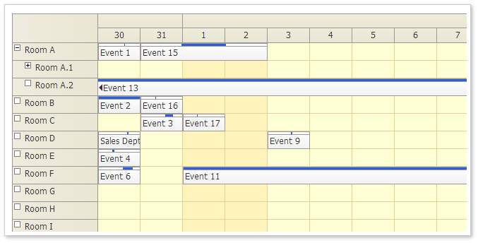
Demo:
Theme Designer:
Traditional Event Calendar CSS Theme (calendar_traditional)
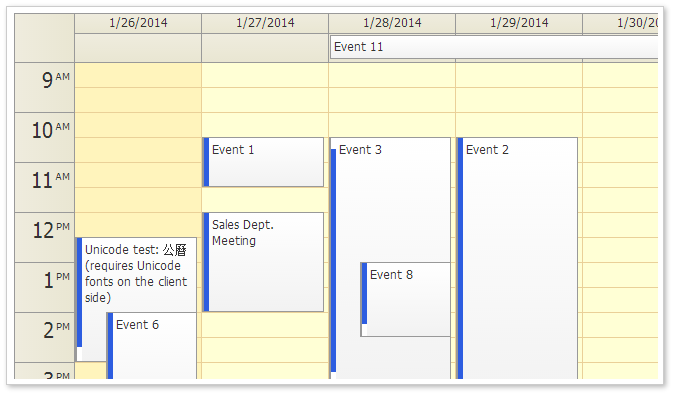
Demo:
Theme Designer:
Traditional Monthly Calendar CSS Theme (month_traditional)
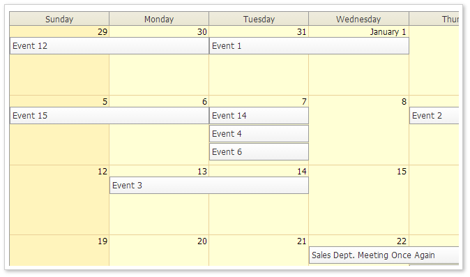
Demo:
Theme Designer:
Default MoveBy Handling Unified
The default moveBy value is now unified. All widgets (Calendar, Month, Scheduler) use moveBy="Full" by default.
Minimal Initialization Code
The boilerplate required for widget initialization is reduced.
- All widgets include a default CSS theme. If you want to start with the default look, there is no need to include a stylesheet with the theme and set the cssClassPrefix/theme value.
- The default values are adjusted so they work with the CSS themes without further tweaking. This includes the default values for .eventHeight, .moveBy, cellWidth.
- The ToolTip is automatically turned off when bubble is activated.
Old Scheduler example (version 7.6):
<script src="js/daypilot-all.min.js" type="text/javascript"></script>
<link type="text/css" rel="stylesheet" href="themes/scheduler_white.css" />

<div id="dp"></div>

<script type="text/javascript">
    var dp = new DayPilot.Scheduler("dp");

    dp.cssClassPrefix = "scheduler_white";
    dp.moveBy = 'Full';
    dp.cellWidth = 40;
    dp.eventHeight = 25;

    dp.showToolTip = false;
    dp.bubble = new DayPilot.Bubble({
        cssClassPrefix: "bubble_default"
    });

    dp.resources = [{name: "Room A", id: "A"}];
    dp.init();
</script>
New Scheduler example:
<script src="js/daypilot-all.min.js" type="text/javascript"></script>

<div id="dp"></div>

<script type="text/javascript">
    var dp = new DayPilot.Scheduler("dp");
    dp.resources = [{name: "Room A", id: "A"}];
    dp.bubble = new DayPilot.Bubble();  // optional bubble
    dp.init();
</script>
Floating Events (Scheduler)
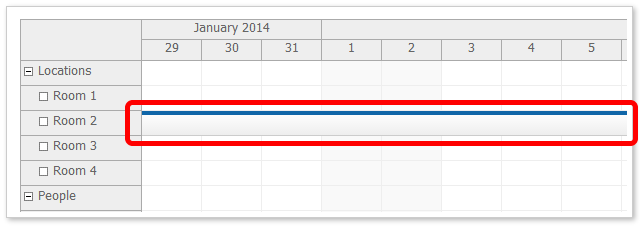
In the previous versions of the Scheduler long events were difficult to read because the text was hidden.

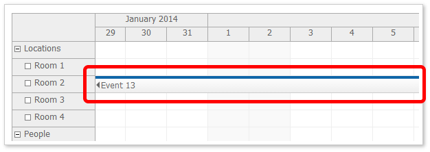
If the beginning of the event is not visible (for long events than start in the past) it displays a special floating div over the event that displays the event HTML.

Read more about floating events in the documentation.
Floating Time Headers (Scheduler)
In the previous Scheduler version long header cells were difficult to read because the text/HTML was hidden.

If the beginning of the header is not visible (for long headers, especially month and year time header groups) it displays a special floating div over the time header cell that displays the event HTML.

Read more about floating time headers.
New Default Settings
Scheduler
- eventHeight = 25
- headerHeight = 20
- cellWidth = 40
- moveBy = "Full"
- preventParentUsage = false
Calendar
- allDayEventHeight = 25
- headerHeight = 20
- moveBy = "Full"
Month
- eventHeight = 25
- headerHeight = 20
Loading Selected Dimension Properties from CSS
You can specify selection dimension properties in the CSS. This is helpful if the CSS is designed to work with different than default dimension. It will soon be added to the online theme designer as well.
This CSS value will override the value specified using the calendar object.
Loading Scheduler Dimensions from CSS Theme
Event Height (.eventHeight property):
*_event_height { height: 25px; }Header Height (.headerHeight property):
*_header_height { height: 20px; }Replace the asterisk with the theme name.
Loading Event Calendar Dimensions from CSS Theme
All-Day Event Height (.eventHeight property):
*_alldayevent_height { height: 25px; }Header Height (.headerHeight property):
*_header_height { height: 20px; }Replace the asterisk with the theme name.
Loading Monthly Event Calendar Dimensions from CSS Theme
Event Height (.eventHeight property):
*_event_height { height: 25px; }Day Header Height (.headerHeight property):
*_header_height { height: 20px; }Replace the asterisk with the theme name.
Auto-Expanding Tree Nodes on Hover during Drag and Drop Moving (Scheduler)
When dragging an event over a row that has child nodes it is automatically expanded after a short delay.
Business Cell Marked with a Special CSS Class (Scheduler)
The business cells are marked with a special CSS class.
*_cell_business
It is applied at the same level as *_cell so you would define the business cell style like this:
.scheduler_default_cell.scheduler_default_cell_business {
  background-color: #fff;
}
This class is not applied when you use .drawBlankCells = true and don't handle .onBeforeCellRender event (for performance reasons).
Loading Free/Busy Data (Navigator)
The navigator allows highlighting busy days.
Features
- [Scheduler] Scheduler: Loading event height from CSS using _event_height. Loading header height from CSS using _header_height class. (build 553)
- [Scheduler] Scheduler: auto-expanding tree nodes during event moving. (build 565)
- [Navigator] Navigator: Supports free/busy configuration using .events.list (same format as DayPilot.Calendar.events.list). (build 567)
- [Calendar] Calendar: Default CSS theme. (build 588)
- [Month] Month: Default CSS theme. (build 588)
- [Bubble] Default theme. (build 596)
- [Scheduler] Default theme. (build 596)
- [Scheduler] Scheduler: Floating event HTML, floating time header HTML. (build 600)
- [Scheduler] Scheduler: Experimental cellWidthSpec. (build 608)
- [Month] Traditional theme added. (build 638)
- [Calendar] Traditional theme added. (build 638)
- [Scheduler] Traditional theme added. (build 638)
Improvements
- [Calendar] Calendar: Permanently visible active areas for events. (build 543)
- [Scheduler] Scheduler: cells.all() selection added. (build 549)
- [Scheduler] Scheduler: scheduler_default theme with no external dependencies. (build 551)
- [Scheduler] Scheduler: Default theme updated. (build 552)
- [Scheduler] Scheduler: Event rendering optimizations (especially Chrome). (build 556)
- [Scheduler] Scheduler: Overriding background gradient using backgroundColor in onBeforeTimeHeaderRender, onBeforeResHeaderRender. (build 562)
- [Scheduler] Scheduler: dynamic event loading compares events using id, start, and resource. (build 566)
- [Navigator] Navigator: reload events on .update(). (build 568)
- [Scheduler] Scheduler: onAfterRender firing after onScroll update as well. (build 587)
- [Scheduler] Default themes, cssClassPrefix --> theme. (build 596)
- [Scheduler] Scheduler defaults: cellWidth = 40, headerHeight = 20. (build 596)
- [Scheduler] Not showing the tooltip when bubble is set (ShowToolTip). (build 596)
- [Scheduler] theme_green updated for floating elements, cleanup. (build 600)
- [Scheduler] Scheduler: Updated theme_green, updated theme_transparent (text floating support). (build 600)
- [Scheduler] Scheduler: scheduler_white theme updated for text floating. (build 600)
- [Scheduler] Scheduler: Windows 8 CSS theme updated for text floating (scheduler_8). (build 600)
- [Scheduler] Scheduler: Blue theme added, updated for text floating. (build 600)
- [Calendar] Themes updated (business hours). (build 601)
- [Month] Themes updated (business hours). (build 601)
- [Calendar] Not showing tooltip when bubble is defined. (build 604)
- [Month] Not showing tooltip when bubble is defined. (build 604)
- [Month] Month: Marking business days. (build 605)
- [Scheduler] Scheduler: onAfterRender called correctly after all events are rendered after onScroll. (build 606)
- [Scheduler] Scheduler: integrated debug console. (build 607)
- [Scheduler] Scheduler: Separate textFloatingEvents, textFloatingTimeHeaders properties. (build 608)
- [Scheduler] Scheduler: Faster update during scrolling (immediate cell rendering, smaller delay for event rendering in dynamicRendering mode). (build 608)
- [Scheduler] Scheduler: event rendering delay increased again (scrolling). (build 610)
- [Scheduler] Scheduler: Text floating optimizations. (build 614)
- [Scheduler] Scheduler: Delaying floats update. (build 615)
- [Scheduler] Scheduler: Optimizing floats update. (build 617)
- [Scheduler] Scheduler: Auto Cell Width demo added. (build 629)
- [Calendar] Calendar: moveBy="Full" (default value) Calendar: duration bar style added to default css (build 629)
- [Scheduler] Scheduler: Improved default theme. (build 631)
- Default themes unified. (build 632)
- [Scheduler] Scheduler: textFloatingEvents -> floatingEvents, textFloatingTimeHeaders -> floatingTimeHeaders. (build 635)
- [Calendar] New defaults: allDayEventHeight = 25, headerHeight = 20 (build 635)
- [Scheduler] New defaults: eventHeight = 25, headerHeight = 20 (build 635)
- [Month] New defaults: eventHeight = 25, headerHeight = 20 (build 635)
- [Scheduler] Scheduler: marking business cells with _cell_business. (build 635)
- [Scheduler] Scheduler defaults: preventParentUsage = false. (build 639)
- [Scheduler] Scheduler defaults: moveBy = "Full" (build 639)
- [Calendar] Calendar: Permanently visible column header active areas. (build 640)
- [Scheduler] Scheduler: Vertical task moving in Gantt chart allowed. (build 643)
Fixes
- [Scheduler] Scheduler: Fixing time range selection for ShowNonBusiness = false. (build 546)
- [Scheduler] Scheduler: Cell BackgroundImage applied correctly. (build 548)
- [Scheduler] Scheduler: Grid width in Days mode fixed. (build 569)
- [Scheduler] Scheduler: Fixing missing events on initial load on Android. (build 581)
- [Scheduler] Scheduler: cssClassPrefix --> theme. (build 595)
- [Scheduler] Scheduler: onTimeHeaderClick event arguments fixed. (build 606)
- [Scheduler] Scheduler: detecting when the scheduler becomes visible (e.g. in a tab), fixing the view (build 607)
