 DayPilot
DayPilot Lite
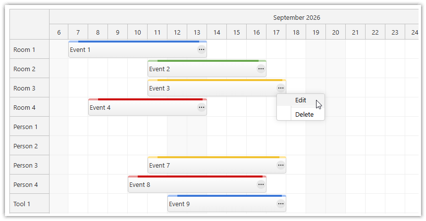
DayPilot Lite is a free and open-source version of DayPilot — a library of calendar and scheduler UI components. It helps you build event calendars, resource schedules, project timelines, and maintenance schedules.
The scheduling components are available for plain JavaScript, Angular, React, and Vue.
License: Apache License 2.0
Features
The open-source edition includes the following features by component. See the feature matrix for the full list.
Scheduler
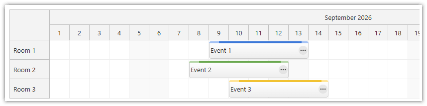
Horizontal timeline with resources as rows (people, rooms, machines, vehicles)
Adjustable Scheduler scale: minutes, hours, days, and weeks, plus custom minute blocks with
cellDuration; grouped time headers can show higher-level labels, such as months above days or months above weeksDay/week/month view switching and runtime density levels
Drag-and-drop event creation, moving, resizing, and copying, with snap-to-grid support
Asynchronous post-drop validation of drag-and-drop changes (accept or reject a move after a server check)
Overlap handling using event handlers (for example, pushing existing events back)
Cell styling: alternating colors, weekend shading, and global or resource-specific holidays with blocked actions
Read-only mode (global or per event)
Icons, buttons, progress bars, custom drag handles, and other custom elements inside events and headers
Framework-rendered content in events and grid cells (JSX in React, templates in Vue)
Progressive rendering for large boards
Touch device support: tap, tap-and-hold, and touch-drag gestures
Undo/redo
CSS themes, editable by hand or generated in the Theme Designer
Built-in XSS protection: text values are encoded automatically
Localization (12/24-hour clock, day and month names, date and time format, first day of the week)
Calendar
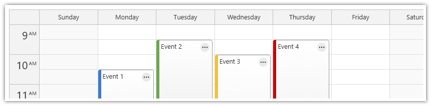
Day and week views with time on the vertical axis, plus integrated day/week/month switching using a single data source
Resource view with any number of custom columns, such as people, tools, or rooms
Drag-and-drop event creation, moving, and resizing
Custom event data properties to adjust the appearance of individual events
Zoom-style density controls, plus column selection and highlighting
Read-only mode with per-event locks
Date navigation via the Navigator date picker
CSS themes, editable by hand or generated in the Theme Designer
Built-in XSS protection: text values are encoded automatically
Localization (12/24-hour clock, day and month names, date and time format, first day of the week)
Right-to-left (RTL) mode
Undo/redo
Month and Navigator
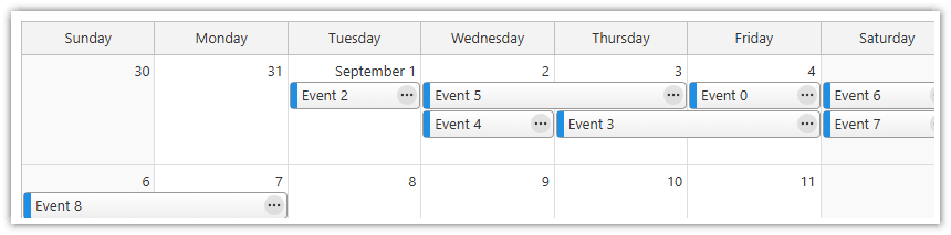
Monthly event calendar with one cell per day
Navigator date picker with busy-day highlighting, freehand range selection, week numbers, and diagonal cell splits for partially busy days
Built-in XSS protection: text values are encoded automatically
Localization (12/24-hour clock, day and month names, date and time format, first day of the week)
Undo/redo
Common
Bundled modal dialog (
DayPilot.Modal) for quick prototypingContext menu
TypeScript definitions
NPM packages for JavaScript/TypeScript, Angular, React, and Vue, plus a standalone production file for use with a script tag
90+ open-source tutorials (including downloadable projects and GitHub source code)
UI Builder
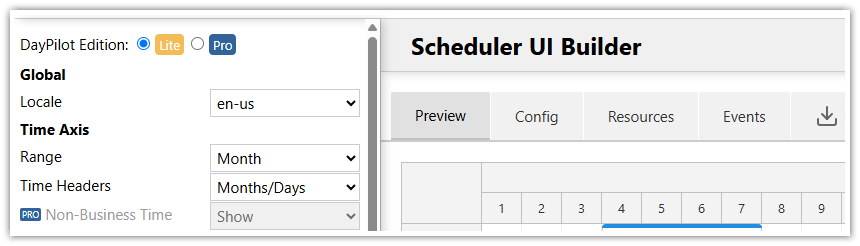
Build a prototype in minutes: configure a Scheduler or Calendar in the UI Builder and download a ready-to-run DayPilot Lite project for JavaScript, TypeScript, Angular, React, Vue, or Next.js.
Scheduler with Horizontal Timeline
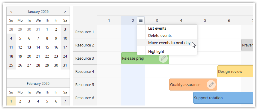
The Scheduler displays resources as rows on a horizontal timeline: rooms, people, machines, vehicles. It is the board for reservation systems, production planning, and dispatch, where the question is who is doing what, and when.
A working open-source Scheduler is a short configuration. The timeline is defined by properties: the scale sets the cell size from minutes to weeks, grouped time headers stack labels such as month over day, and the visible range is a start date and a length, so switching the board to the next quarter is a property change. Day, week, and month views are the same mechanism: predefined configurations that your application swaps at runtime, and zoom sliders and density buttons ride on it too.
Editing is drag and drop: users create, move, resize, and copy events directly on the board (see Drag and Drop Scheduling). Events carry custom data that drives their appearance, and grid cells carry calendar context such as weekend shading and holidays (see Event Appearance and Cell Styling below).
Tutorials:
Resource Calendar with Vertical Timeline
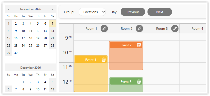
The resource calendar is the same board with the axes switched: time runs down, and the columns are your resources instead of days. It is the shape for one day in detail, with people, rooms, or tools side by side, in any number.
Columns can be selected and highlighted by clicking their headers, and right-to-left (RTL) mode is supported for RTL locales. The editing model is shared with the Scheduler: selecting a time range, moving, resizing, and the modal dialog work the same way in both orientations.
Tutorials:
React Resource Calendar · Next.js Resource Calendar · Angular Resource Calendar · Vue Resource Calendar
Day/Week/Month Calendar
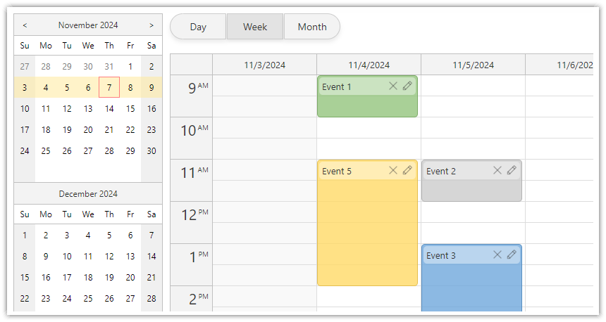
The traditional calendar, the view people know from Outlook and Google Calendar. The Calendar component displays days as columns at hour or minute resolution, and the Month component displays events in a month grid for date-first overviews.
The flagship pattern combines them: an integrated day/week/month calendar over one data source, with the views switched at runtime and a date picker keeping them in sync. The tutorials build it for React, Angular, Vue, and Next.js. Grid cells carry calendar context here as well: business hours, a highlighted today column, or a blocked lunch break.
Tutorials:
Integrated day/week/month views: React · Angular · Vue · Next.js · PHP/MySQL
Weekly calendar: React · Vue · JavaScript + ASP.NET Core
Monthly calendar: React · Next.js · Vue · JavaScript + ASP.NET Core
Large Boards
A scheduling board grows in two directions at once: more resources, and a longer timeline. The open-source Scheduler is built for both, using the same progressive rendering engine as DayPilot Pro. Grid cells, events, and row headers are all rendered progressively: the component draws the current viewport first and fills in the rest as the user scrolls. This is the default behavior in all three layers, and the live demo runs it at full size, a thousand resources on a one-year, day-by-day timeline.
The rendering pipeline is tunable, not a black box. Each layer has its own scroll debounce delay (scrollDelayEvents, scrollDelayCells, scrollDelayRows), so you decide what draws immediately and what waits until scrolling settles; out of the box, cells and row headers render immediately and events follow after 200 ms. Buffers control how far beyond the viewport the component renders ahead (dynamicEventRenderingMargin for events, progressiveRowRenderingPreload for rows), and a cache keeps a limited number of rendered events alive and purges the rest, so a long scrolling session does not accumulate DOM (dynamicEventRenderingCacheSize, dynamicEventRenderingCacheSweeping). The defaults are starting values; the knobs exist so you can tune the board against your own data.
Two default-on details keep a long board readable while all of this is happening. Floating time headers pin the label of a partially scrolled header cell, so the current month stays visible on a year-long timeline. Floating events do the same for event text: when a long event starts off-screen, its text floats into the visible part.
Demo:
Drag and Drop Scheduling
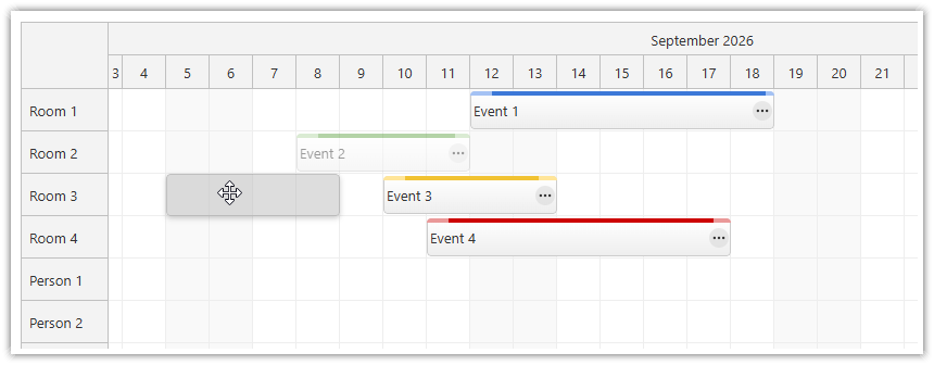
All editing follows one model: the component fires an event, and your code persists the change or vetoes it. Users create an event by selecting a time range on a row, and the bundled modal dialog closes the loop from selection to saved event. Moving and resizing are enabled by default, snap to grid keeps the results aligned to the timeline cells, and events can be copied instead of moved.
The same handlers implement your scheduling policies. When a dropped event lands on an occupied slot, your code decides what happens next, for example shifting the existing events back to make room. A change can also be validated asynchronously after the drop: the application checks the move against the server and accepts or rejects it before the board updates. Real-time validation during the drag itself is a DayPilot Pro feature (see the Feature Matrix).
When a schedule should not be edited, the whole board switches to read-only at runtime, or individual events are locked through their data, with a padlock icon marking them.
Tutorials:
Read-only: read-only mode · edit mode switching (Angular) · padlock icons (Calendar)
Undo/redo: JavaScript · Angular · React · Vue
CSS Themes
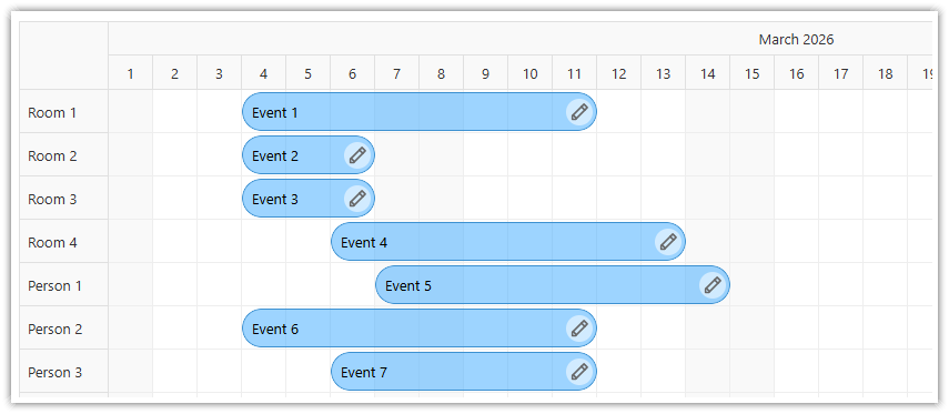
The components are styled using CSS. The default theme is embedded, so a first board needs no separate stylesheet; a custom theme is a stylesheet plus the theme property. You can build one visually in the Theme Designer, against a live preview, and export a stylesheet you keep in source control.
The same theme language covers all DayPilot components, in both editions. The demo shows several sample themes, including a diagonal theme built entirely in CSS.
Tutorials:
Date Picker
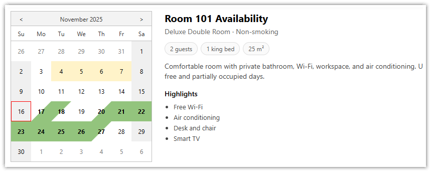
The Navigator is a date picker that switches the visible range of a Calendar, Scheduler, or Month, and it highlights busy days from the same event data, so the picker shows availability before the user commits to a view. Users can select a range free-hand by dragging, and partially busy days can render with a diagonal split, the hospitality pattern where one day holds a check-out and a check-in. Week numbers are supported, and on the Scheduler the Navigator fits naturally into the upper-left corner above the row headers.
Features:
Display a custom number of months
Vertical or horizontal orientation
Optional week numbers
Range modes: day, week, month
Select a custom date range using drag and drop
Highlight busy days automatically (load the data in the same format that is used by the calendar components)
Tutorials:
Cell Styling, Holidays, and Disabled Days
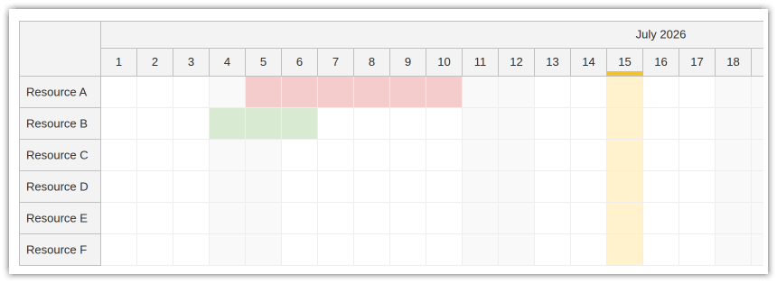
Grid cells can be styled individually, so the board carries its own calendar context: weekend shading, alternating column colors, and holidays loaded as data. Holidays can be global or resource-specific, so one team's public holiday does not gray out another's row. The same data can guard user actions: selections, moves, and resizes that overlap a holiday can be blocked, so nothing gets scheduled into them by accident. The holiday tutorial builds the full pattern, resource-specific rules first with a global fallback.
Tutorials:
Event Appearance
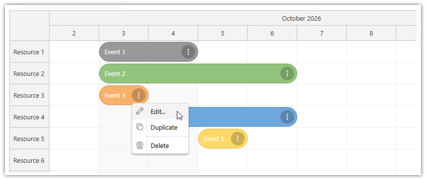
Each event accepts custom data properties, and a rendering hook exposes the event data for your application to adjust before it is drawn: a confirmed reservation turns green, an overdue task gets a warning icon. Active areas add positioned elements inside the event box: status icons, action buttons, custom drag handles, progress bars, and diagonally split corners, the check-in/check-out pattern where one cell shows the outgoing and incoming booking. Active areas work in row headers too, so a resource row can carry its own buttons or indicators.
When markup is not enough, events and grid cells render framework content directly: JSX in React, templates in Vue. A cell can carry a checkbox, a dropdown, a slot price, or a computed marker, and it stays a live framework component.
Tutorials:
How to Add Interactive Elements to Vue Scheduler Events Using Templates
Vue Calendar: Using Templates to Add Icons, Buttons, or Progress Bars to Events
JavaScript Scheduler: Use Diagonally Split Cells for Check-In/Check-Out
Modal Dialog
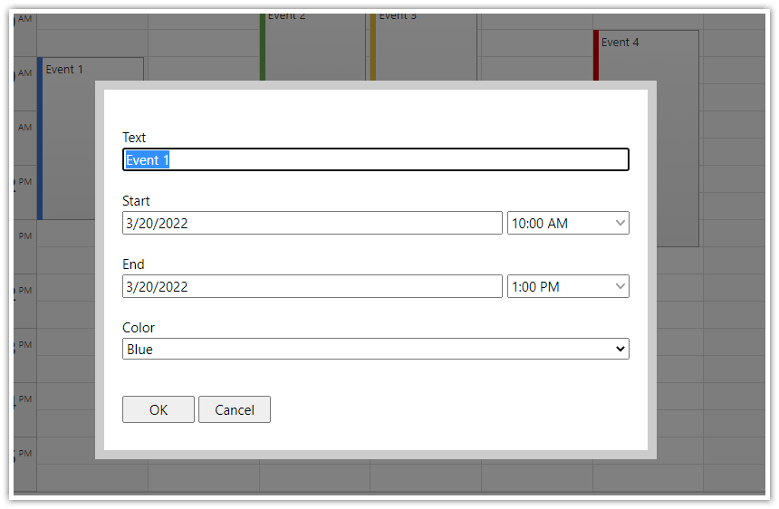
The DayPilot library includes a programmatic modal dialog that lets you edit calendar events. You can use it to edit the scheduler event standard fields (text, start, end) and also any custom fields that you define.
It has built-in support for many field types (such as text, checkbox, radio selection, searchable drop-down list, tabular data, readonly image, HTML and scrollable text). It includes special handling of date and date/time fields that let you modify the scheduler event start and end values using a date and time picker.
Dynamic Context Menu
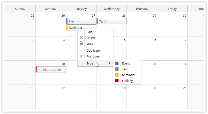
You can add a context menu to scheduler events to provide access to additional operations.
The context menu can display icons (JPEG, PNG, SVG) before the text.
Use separators to group menu items.
Menu items can have children (submenu).
Bind the context menu to left or right mouse click.
Change the context menu item text on the fly, depending on the event type.
Enable/disabled menu items dynamically depending on calendar event status.
Show a complete list of actions that can be performed on events/tasks.
Provide shortcuts to common actions such as lock, duplicate, postpone, copy, assign, change status, export, and print calendar events.
The context menu automatically adjusts its own position so that it is displayed inside the current viewport.
Tutorials:
Angular Scheduler and Calendar
DayPilot Lite is available for Angular (@daypilot/daypilot-lite-angular). It includes these Angular components:
React Scheduler and Calendar
The React version of DayPilot Lite is available at NPM as @daypilot/daypilot-lite-react package.
React components:
Vue Scheduler and Calendar
You can use DayPilot Lite in your Vue application as well. The Vue package name is @daypilot/daypilot-lite-vue.
Vue components:
License
DayPilot Lite for JavaScript is open-source (Apache License 2.0).
The following attribution is required:
This software includes DayPilot (https://www.daypilot.org).
What's New
Subscribe to release notifications.